
Overview
Most parents check their emails on their phones — often while picking up kids or waiting between activities. That's why every email you send from Enrollio should look great on mobile devices.
This guide shows you how to adjust your email templates specifically for mobile viewing, ensuring parents can easily read your enrollment updates, event announcements, and other communications on any device.
What You'll Learn
- How to adjust mobile formatting in your email templates
- How to preview your emails on mobile before sending
Adjusting Mobile Formatting in Your Email Template
Enrollio's drag-and-drop email builder includes default mobile settings that work well on smaller screens. You can customize these settings to match your childcare center's branding and improve readability.
Step-by-Step Instructions
- Open your email template or campaign in the email builder
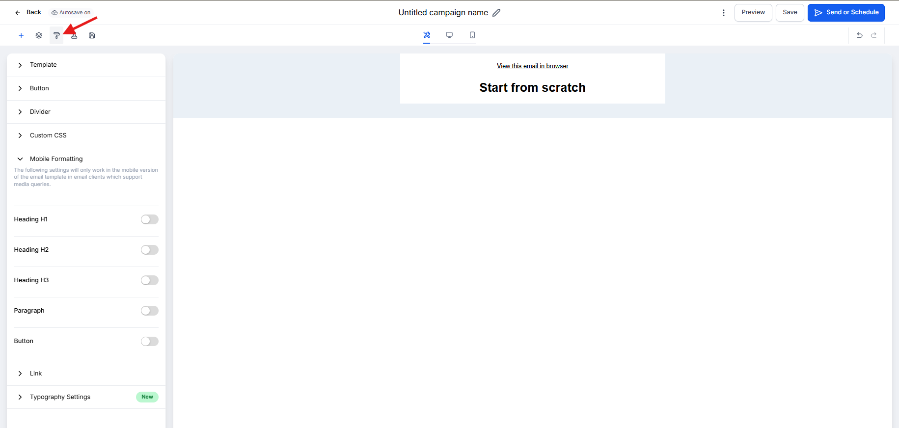
- Click the Appearance tab at the top of the editor
- Select Mobile Formatting from the options
- Adjust the mobile-specific settings:
- Font Size: Toggle on to enable custom mobile font sizes
- Line Height: Adjust spacing between lines for easier reading
- Button Style: Toggle on to customize button appearance on mobile
- Alignment: Choose how content aligns on smaller screens
- Click Save to apply your changes
Pro Tip: Font sizes that work on desktop can be too small on mobile. Enable the mobile font size toggle and increase text to at least 14-16px for body content so parents don't have to zoom in.
Note: These mobile formatting settings only apply when parents view your email on devices that support responsive email design (most modern email apps do). Some older email clients may display the desktop version regardless.
Preview Your Email on Mobile
Always preview your email on mobile before sending it to families. This helps you catch formatting issues and ensure your message is easy to read.
How to Preview
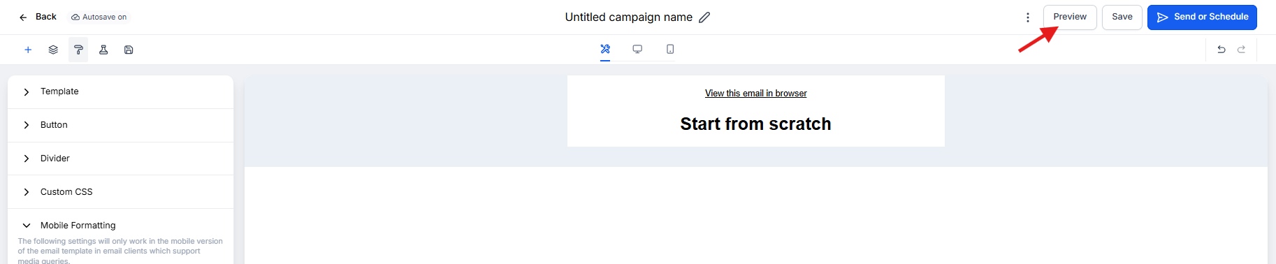
- After saving your template, click the three dots menu (⋮) in the top-right corner
- Select Preview on Mobile
- Review how your email appears on a mobile screen
- Check that buttons are easy to tap, text is readable, and images display properly
Best Practice: Send a test email to yourself and open it on your actual phone. This is the best way to see exactly what parents will experience when they receive your message.
Mobile Email Design Tips for Childcare Centers
- Keep subject lines short: Mobile screens show fewer characters — aim for 30-40 characters
- Put important info first: Parents scanning quickly should see key details (dates, deadlines, action items) at the top
- Make buttons big enough to tap: Minimum 44x44 pixels so parents don't accidentally tap the wrong thing
- Use single-column layouts: Multi-column designs often break on mobile devices
- Test before sending: Always preview on mobile and send yourself a test
Related Articles
- How to Use the Email Builder
- Layout Margins and Text Spacing Controls
- How to Preview Personalized Content in Your Emails
- Hide Email Elements on Mobile View