
Overview of the Right Sidebar in Form and Survey Builder
The Right Sidebar is your control center for styling forms and surveys in Enrollio. It centralizes all visual and layout settings — colors, spacing, themes, and advanced options — so you can preview changes instantly and keep your enrollment forms looking professional.
The right sidebar has three main tabs:
- Styles: Fine-tune the layout and appearance of your form or survey
- Themes: Apply ready-made design presets for consistent branding
- Advanced: Access specialized styling options for deeper customization
How to Open the Right Sidebar
When you're building a form or survey, click the Styles & Options button in the upper right corner to open the sidebar.
Click it again to collapse the sidebar and see more of your canvas.
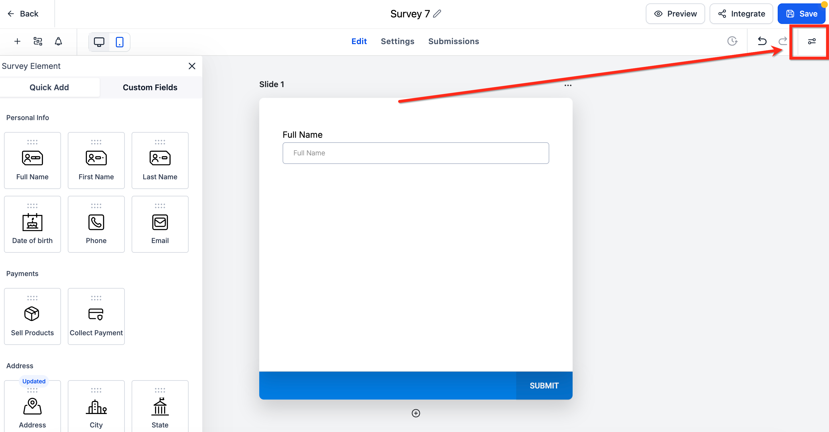
Styles Tab
The Styles tab is where you control your form's core layout, color scheme, and branding. Changes update live in the preview, so you can see exactly how your enrollment form will look to parents.
Layout
Define how fields and labels appear on your form. Control input widths, spacing between elements, padding around fields, and the top margin above your entire form.
Pro tip: Use the top-margin controls to adjust spacing without writing custom CSS. Leave margin fields blank to keep the default spacing.
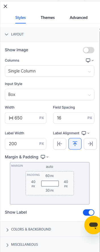
Footer (Surveys)
For surveys specifically, manage footer content and appearance. This is where you control what appears at the bottom of multi-step parent surveys.
Colors & Background
Set font styles, choose background colors, and — where supported — add background images or header imagery that matches your childcare center's brand.
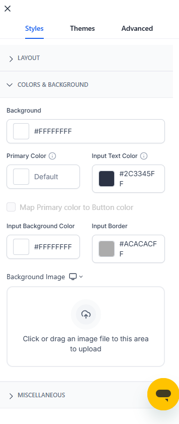
Miscellaneous
Apply or remove Enrollio platform branding from your forms.
Themes Tab
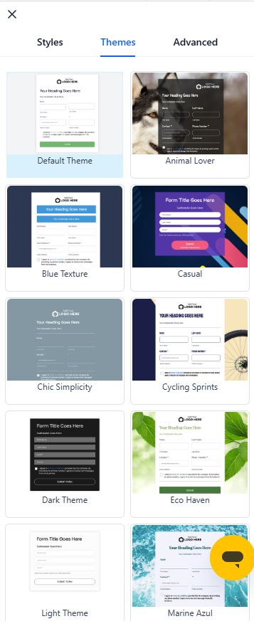
Themes let you create professional-looking enrollment forms fast. Start with a preset, then fine-tune spacing and widths in the Styles tab.
How to Apply a Theme
- Click the Themes tab in the right sidebar
- Hover over any theme to preview it on your form
- Click Use Theme on your chosen design
- Click Proceed in the confirmation popup
Important: Switching themes will replace your current style settings. If you've made custom style changes, they'll be lost when you apply a new theme.
Button Styling Panel
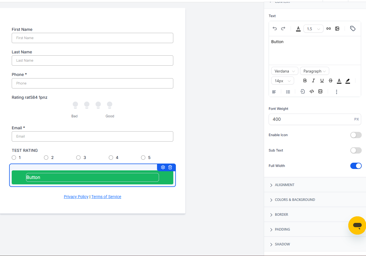
The Button Styling Panel gives you complete control over button appearance — no custom code required. Start with a preset, then customize typography, spacing, borders, shadows, and width to match your brand.
Open the Button Styling Panel
- Open your form in the builder
- Click any button element on your canvas
- In the right sidebar, expand the Button section (or Styles → Button)
Choose a Button Theme
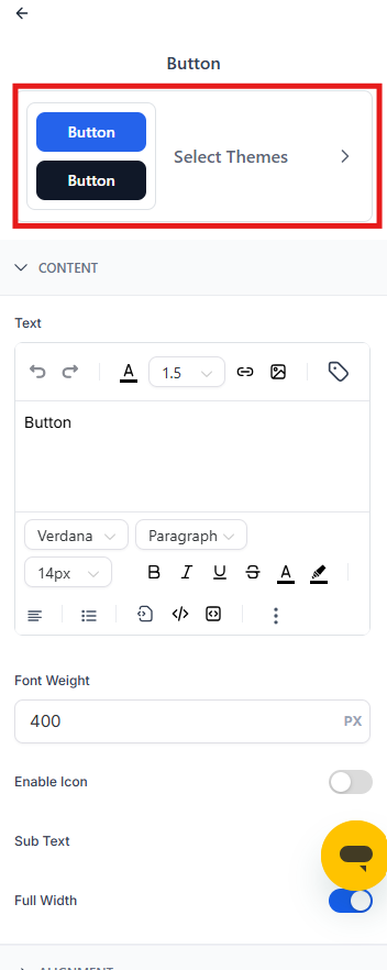
- Click Select Themes
- Browse categories: Filled, Border, and Text Only
- Hover over any theme to preview it live on your button
- Click Apply to set the theme
Customize Button Styles
After choosing a theme, fine-tune every detail to match your childcare center's brand:
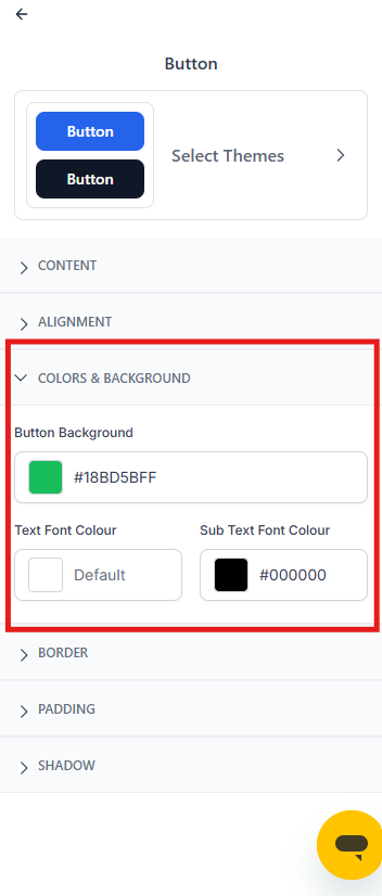
Colors & Background
Set text color, background color, and border colors for your buttons.
Typography
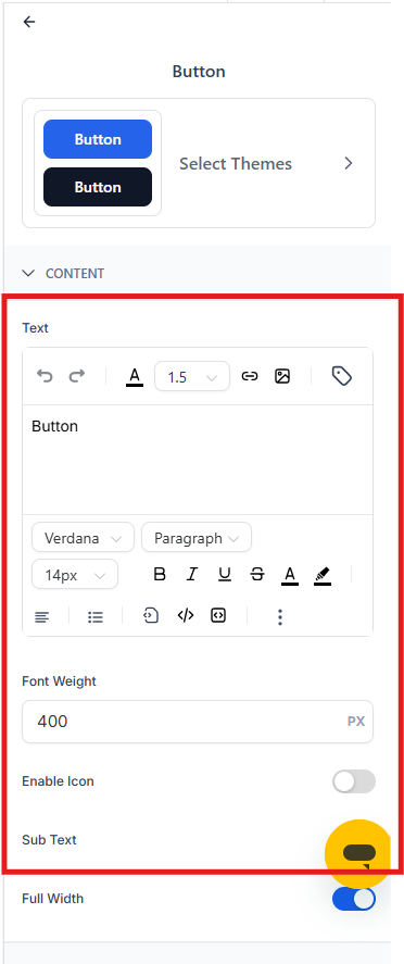
Choose font family and weight (including custom fonts). Adjust size, letter spacing, and text transform (uppercase, lowercase, etc.).
Layout & Alignment
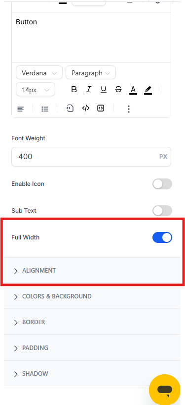
Align your button left, center, or right. Toggle Full Width to make the button span its container — great for mobile-friendly enrollment forms.
Padding
Adjust top/bottom and left/right padding. Link or unlink values to control each direction independently.
Border & Corner Radius
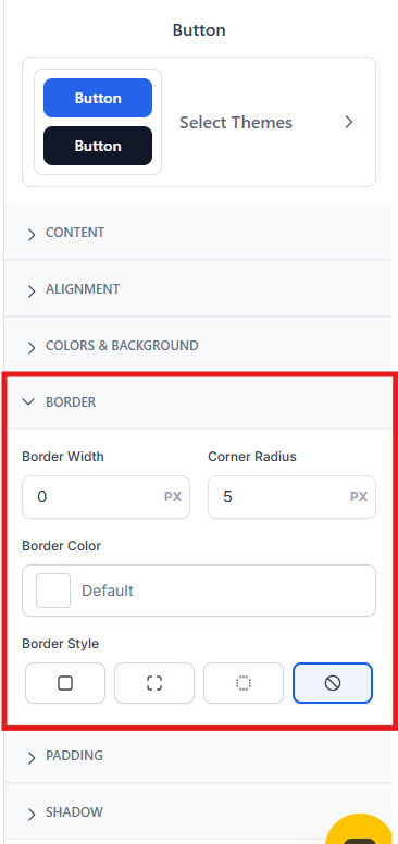
Set border width and style. Adjust corner radius for rounded buttons or keep them square and modern.
Shadow
Enable button shadows, then adjust blur, distance, and spread for depth and dimension.
Reset or Revert Changes
Click Reset or Revert to undo your style changes. Reopen Select Themes to pick a different starting point.
Advanced Tab
The Advanced tab gives you deeper styling options when you need precise control beyond themes and basic styles.
Form Container
Adjust the entire form container's borders, corner radius, and shadow effects.
Input Field
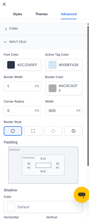
Style the input fields themselves — text color, focus colors, borders, corners, width, padding, and shadows.
Label
Control label typography (font, size, weight) and color for all field labels.
Short Label
Configure typography and color specifically for short-label formats.
Placeholder
Customize how placeholder text appears in empty fields.
Custom CSS
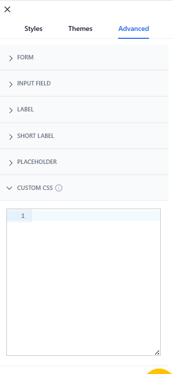
Add custom CSS for precise control when built-in options don't cover your needs.
Important: Custom CSS overrides both Styles and Themes settings. If you add custom CSS and later apply a new theme, review your CSS to avoid conflicts.
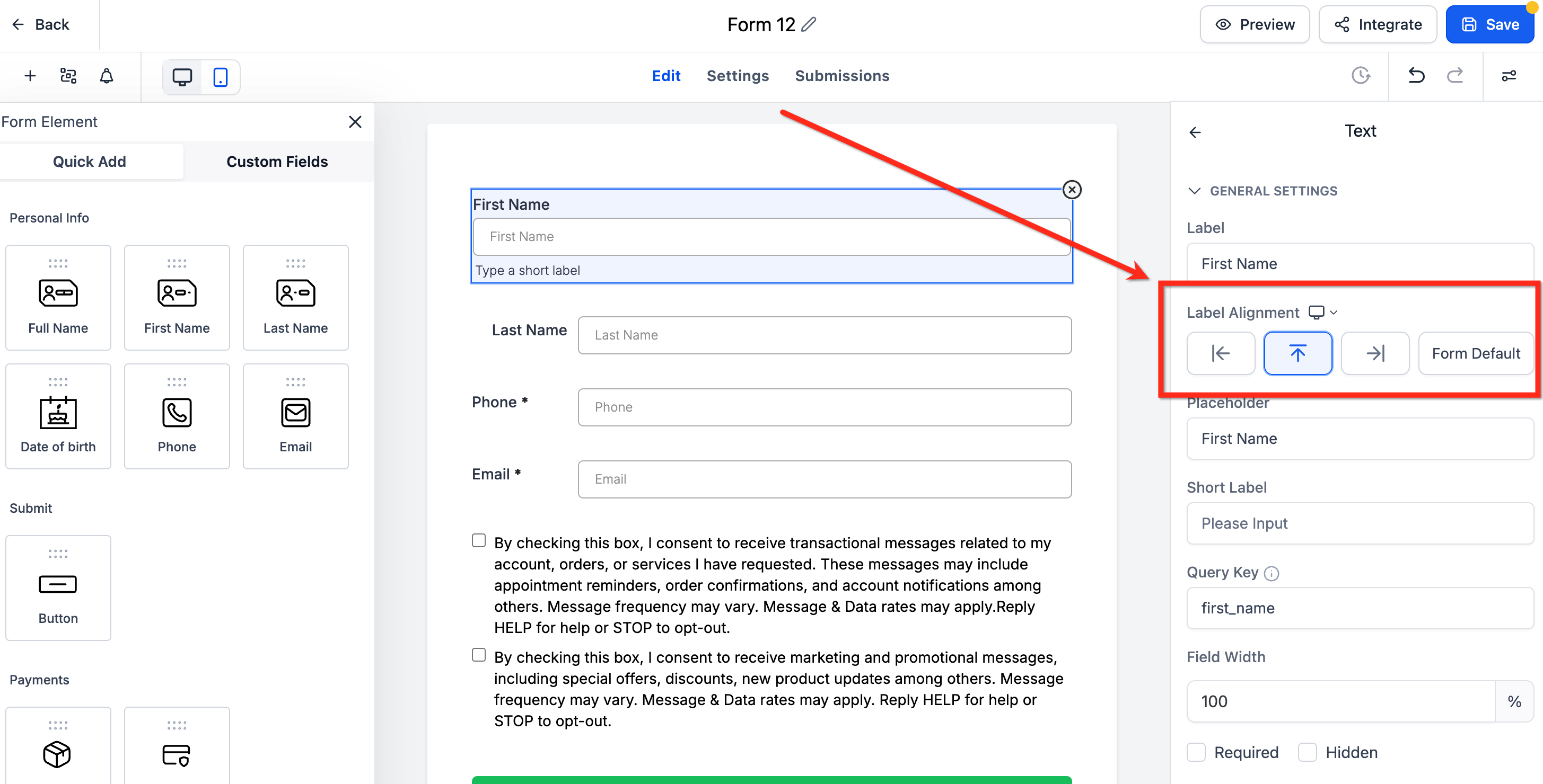
Element-Level Label Alignment
Instead of using one label position for your entire form, you can set different label alignments for individual fields. This is especially useful for compact layouts where different field types need different spacing.
Key Points About Element-Level Label Alignment
- Available in forms, surveys, and quizzes (single-column layout only)
- Works with standard fields: text inputs, dropdowns, radio buttons, and more
- Existing forms keep their global alignment unless you update individual fields
- On mobile devices, labels automatically move to the top for better readability
How to Set Label Alignment for a Single Field
- In the form builder, click any field on your canvas
- In the right sidebar that appears, find Label Alignment
- Choose your alignment using the arrow buttons: Top, Left, Right, or Form Default
Pro tip: Use Form Default when you want a field to follow your global setting. If you change the global alignment later, that field will update automatically.
Frequently Asked Questions
Do changes in the Right Sidebar save automatically?
No. Click Save in the builder to commit your changes.
Will changing themes later overwrite my detailed styling?
Yes, applying a new theme can reset your visual styles. After switching themes, review your Styles tab to make sure everything still looks right.
Custom CSS always overrides themes and styles, so check your CSS for conflicts if something looks off.
How do I test different themes without losing my current design?
After applying a new theme, you can revert to your previous look by clicking the Back button in the upper-right corner of the builder.
What happens to per-field label alignment if I switch to a two-column layout?
Element-level label alignment only works in single-column layouts. If you switch to two-column or single-line layouts, your per-field alignments are removed and labels return to the default setting.
If I change the global label alignment, what happens to fields I already customized?
Fields set to Form Default will update to match the new global alignment automatically. Fields you explicitly set to Left, Right, or Top will keep their individual settings.