
What Are Image Dimension Settings?
Image dimension settings give you precise control over how images appear on your enrollment pages and sites. You can adjust image sizes independently for mobile and desktop views, ensuring parents see sharp, professional visuals no matter what device they're using.
You can specify height and width using multiple units — pixels (px), relative units (rem, em), or percentages (%) — giving you complete design flexibility.
Why Image Dimension Settings Matter
Better Mobile Experience: Parents browse your enrollment pages on phones, tablets, and desktops. Properly sized images adapt seamlessly to every screen size.
Improved SEO Performance: Optimizing image dimensions for each device type improves your Cumulative Layout Shift (CLS) and PageSpeed scores — key factors Google uses to rank your site.
Design Flexibility: Choose the right measurement unit for each image to match your exact design vision.
How to Use Image Dimension Settings
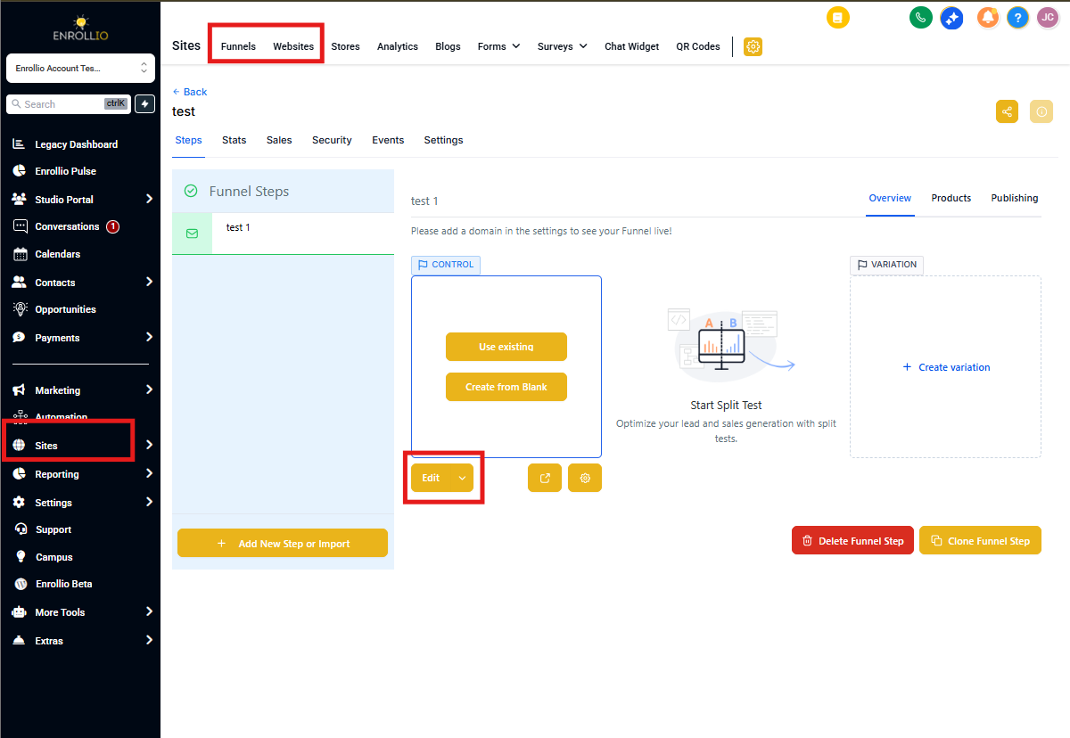
Step 1: Open Your Page Builder
Navigate to your landing page or enrollment site in the Enrollio dashboard.
Select the page containing the image you want to edit.
Step 2: Access Image Settings
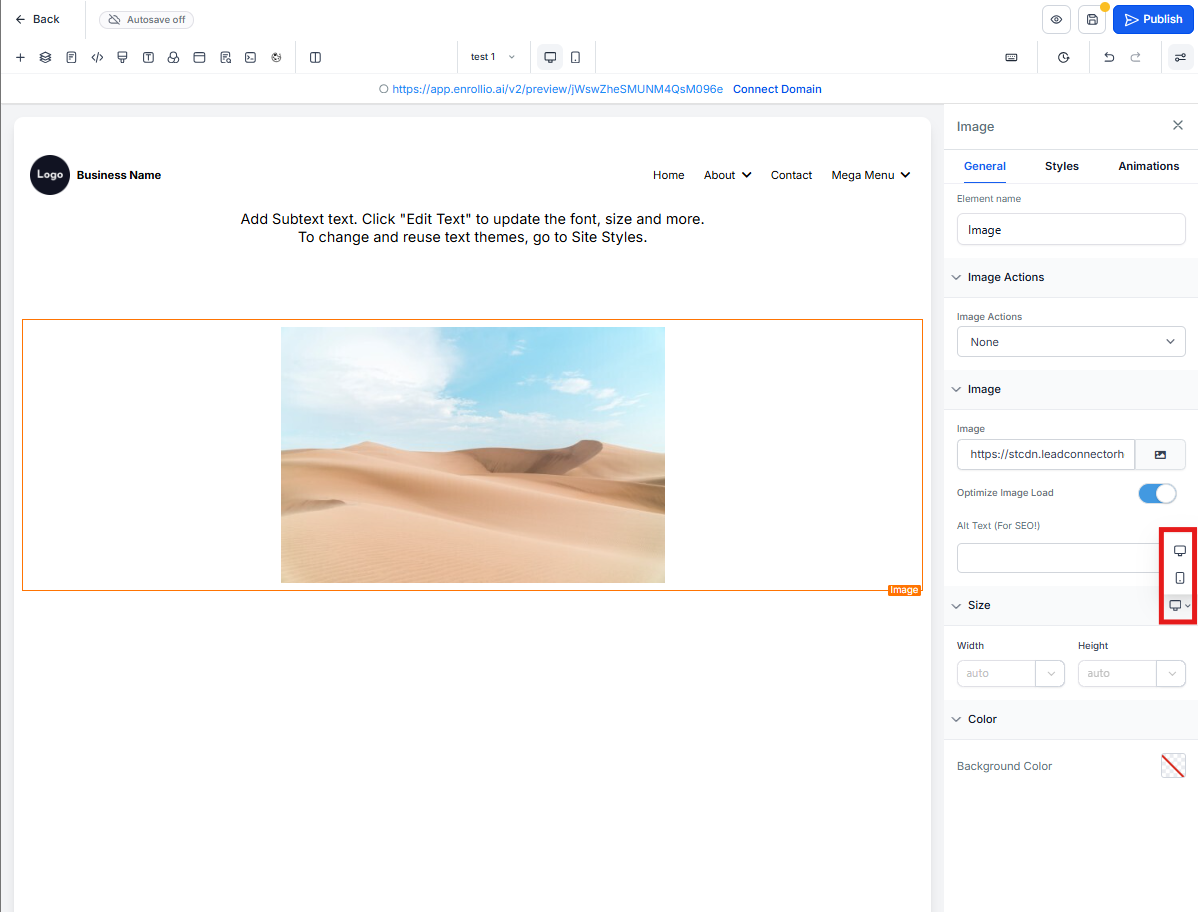
Click on the image to open its settings panel.
Use the preview toggle at the top to switch between Mobile View and Desktop View.
Step 3: Adjust Image Dimensions
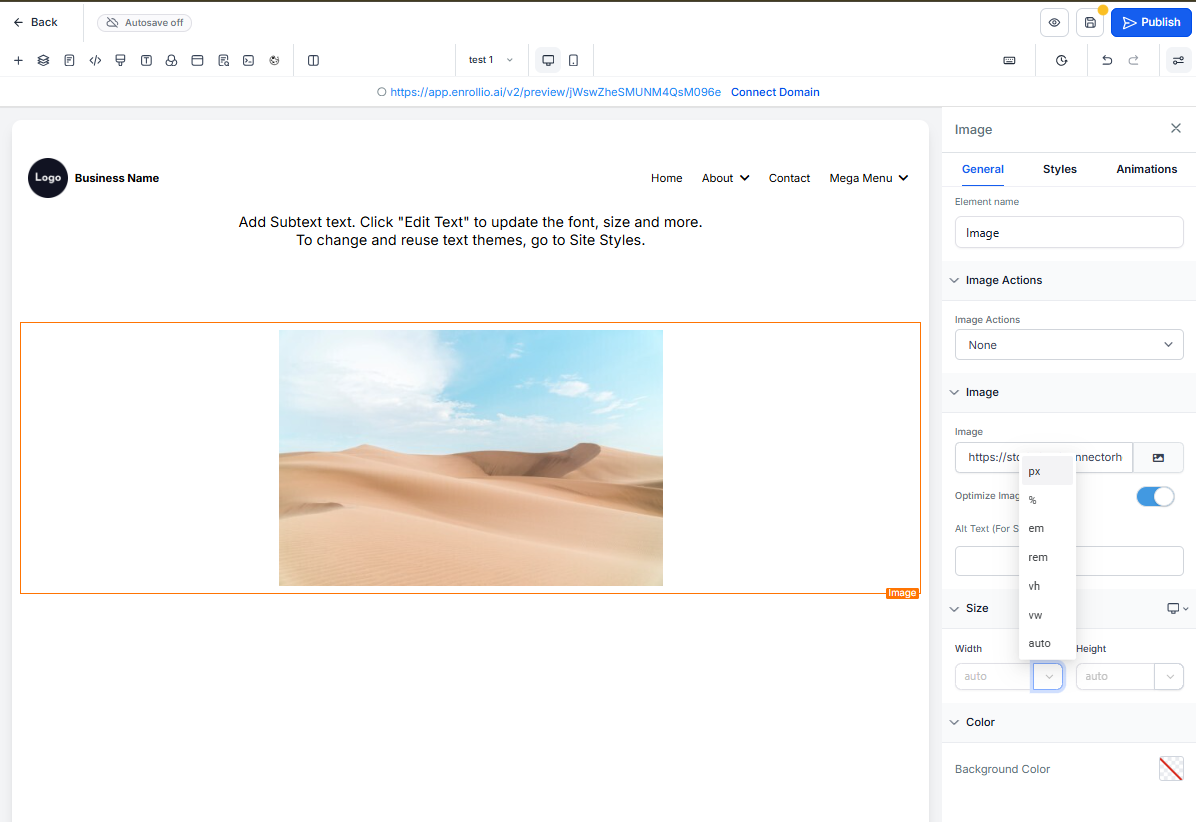
In the image settings panel, locate the Height and Width fields.
Enter your desired values and select your preferred unit:
- px — Fixed pixel dimensions for precise sizing
- rem or em — Scalable dimensions that adjust based on font size
- % — Relative dimensions that scale with the container size
Step 4: Save and Preview
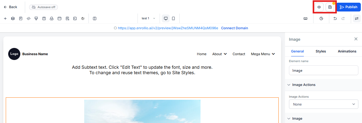
Save your changes and preview your page in both mobile and desktop views.
Check that images look sharp and load properly on both device types.
Frequently Asked Questions
What happens if I don't set specific dimensions for mobile?
If you don't specify mobile dimensions, the image will use your desktop settings by default. This often means images won't be optimized for smaller screens and may look too large or cause layout issues.
How do I choose the best unit for image dimensions?
Use px when you need precise, fixed dimensions that won't change.
Use rem or em for scalable designs that adjust relative to text size.
Use % for dimensions that scale with the container — great for responsive layouts.
Can I use different units for height and width?
Yes. You can mix and match units based on your design needs. For example, set height in pixels (px) and width in percentages (%) to achieve the exact look you want.
Will this affect my existing images?
No. Existing images keep their current dimensions unless you manually change them. You can adjust dimensions for individual images as needed without affecting others.
How can I test if my changes improved page performance?
Use Google PageSpeed Insights or Lighthouse to measure your CLS and PageSpeed scores. Run a test before and after optimizing your images to see the improvement.
Is this feature available for all Enrollio users?
Yes. All Enrollio users have access to advanced image dimension settings in the page builder.