
What is Container Size (Height & Width) Control?
Container Size lets you define an element's height and width directly in the page builder. These values determine how much space an element occupies within its parent container (like a column, row, or section).
You can choose the right unit for your layout and set different values for desktop and mobile devices.
Why Use Container Size Control?
- Precise Layouts — Fine-tune element size for exact designs on your enrollment pages
- Responsive Control — Set different values for desktop and mobile so your pages look great on every device
- Unit Flexibility — Choose between multiple sizing units to pick the right one for each scenario
- Cleaner Builds — Achieve exact results in the builder without needing custom code
Supported Sizing Units
Different units change how size is calculated. The following familiar web-design units are available:
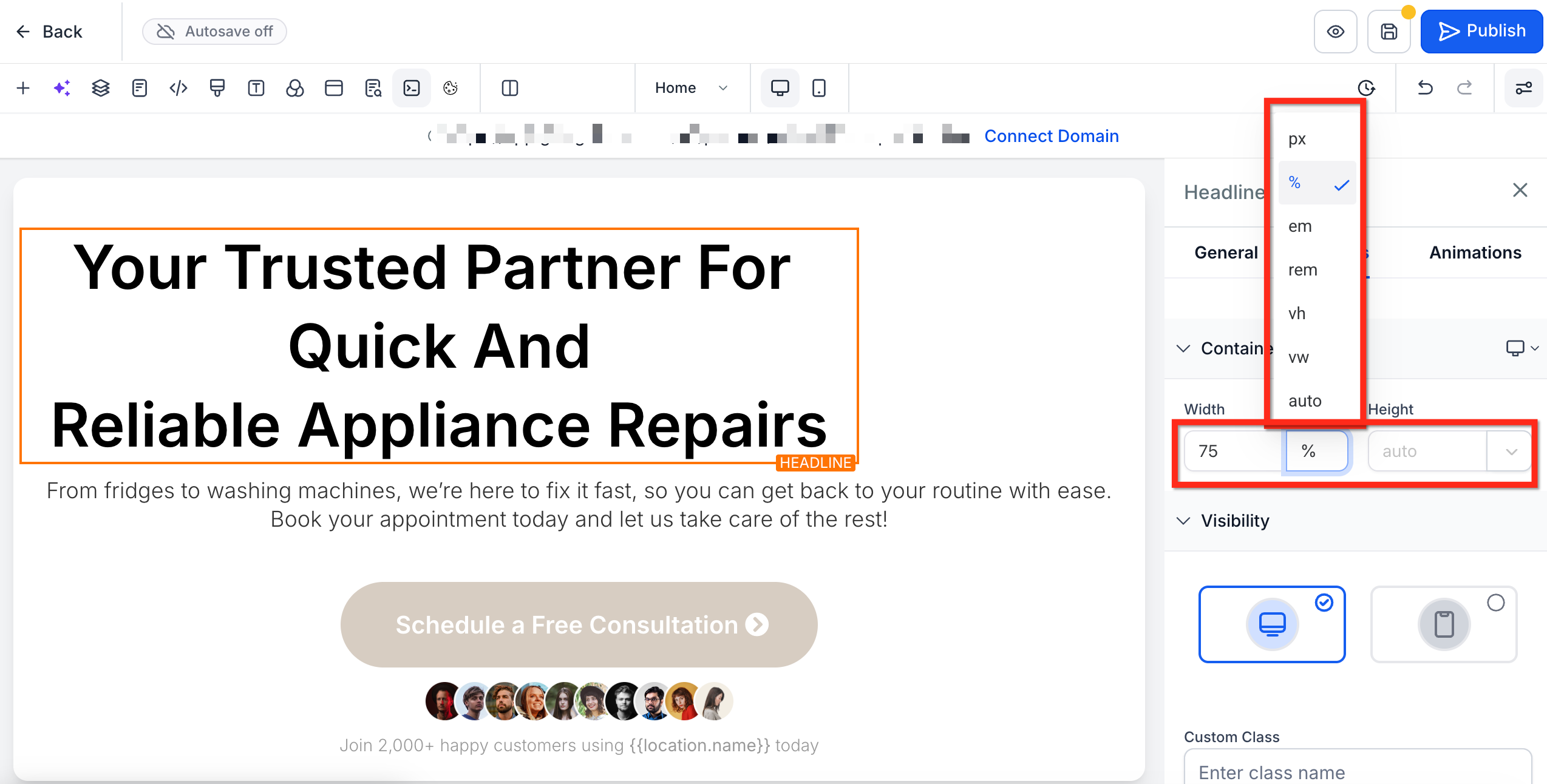
- px — Fixed pixel count (exact sizing)
- % — Percentage of the parent container
- em / rem — Scale relative to font size
- vh / vw — Viewport-based height or width
- auto — Browser decides optimal size
How To Edit Container Size
Follow these steps to set precise dimensions for any element on your enrollment pages:
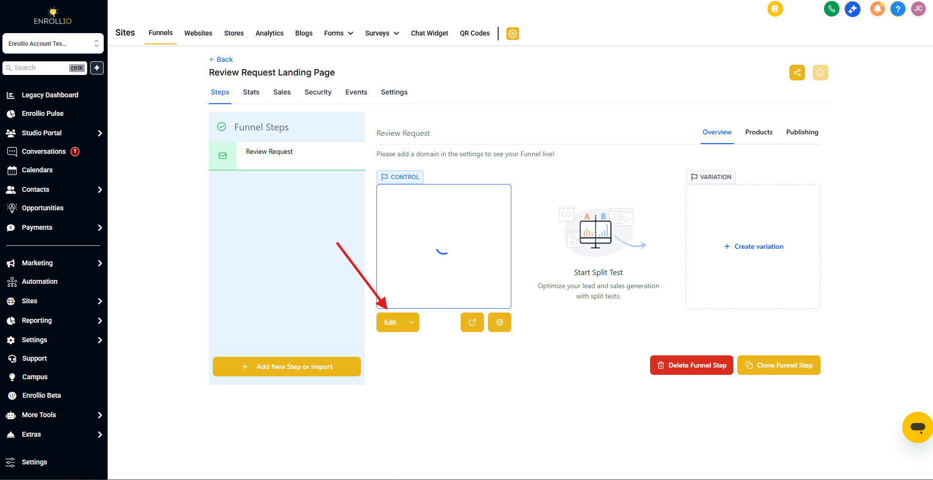
Step 1: Open the Page Builder
Navigate to Sites > Landing Pages or Enrollment Sites. Select your site, then open the Editor for the page you want to edit.
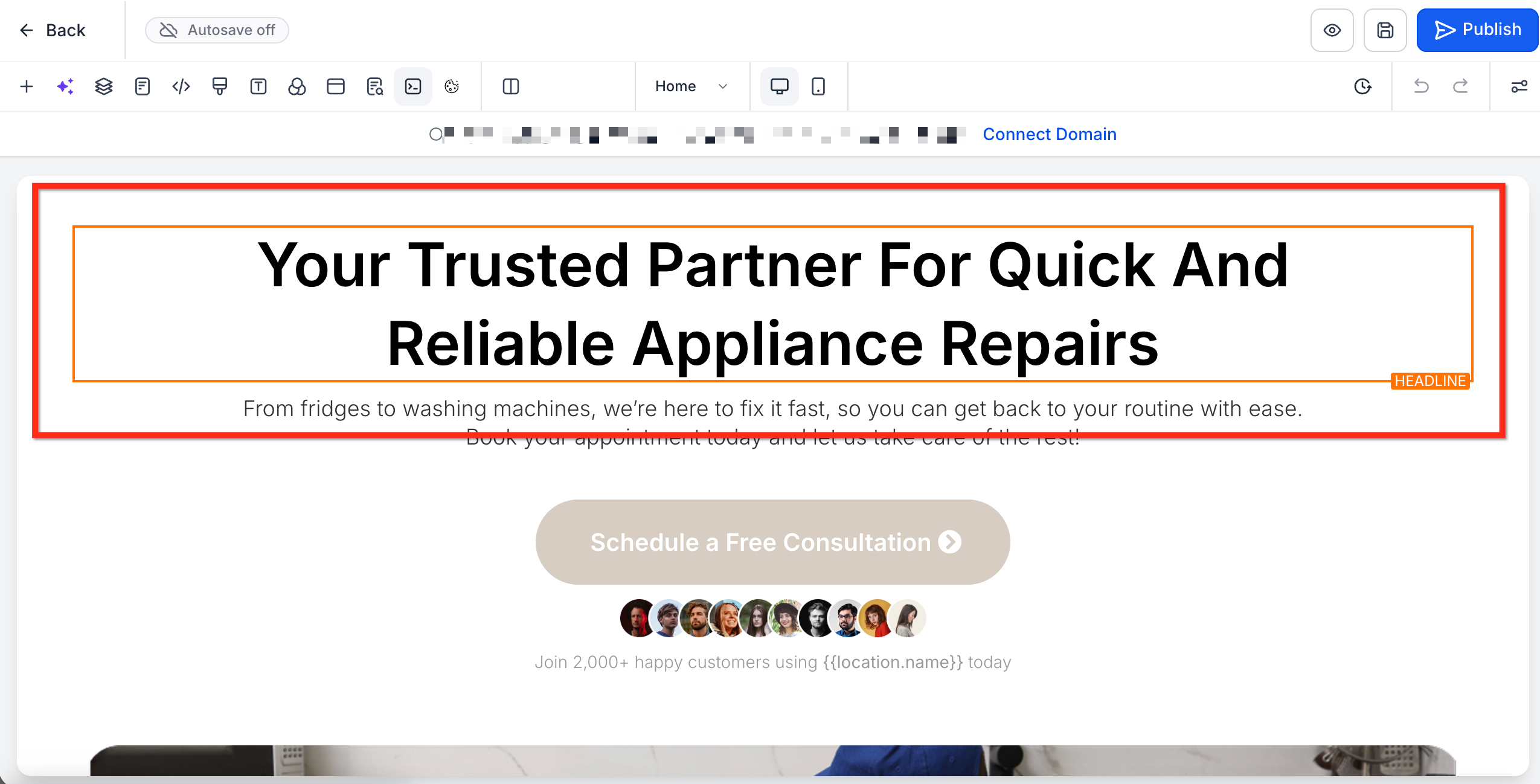
Step 2: Select Element
Click the element you want to resize (text, button, image, form, etc.).
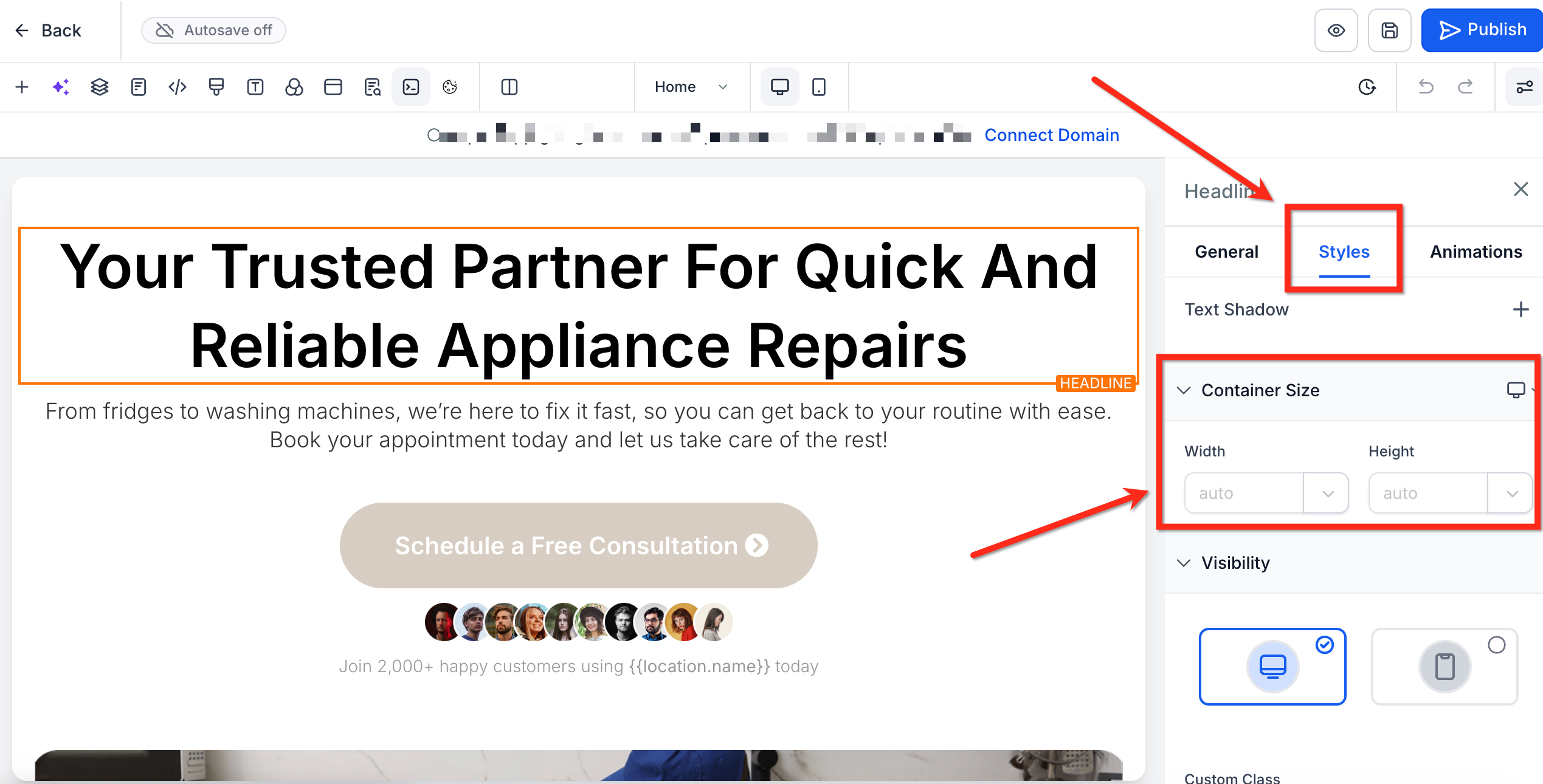
Step 3: Go to Container Size
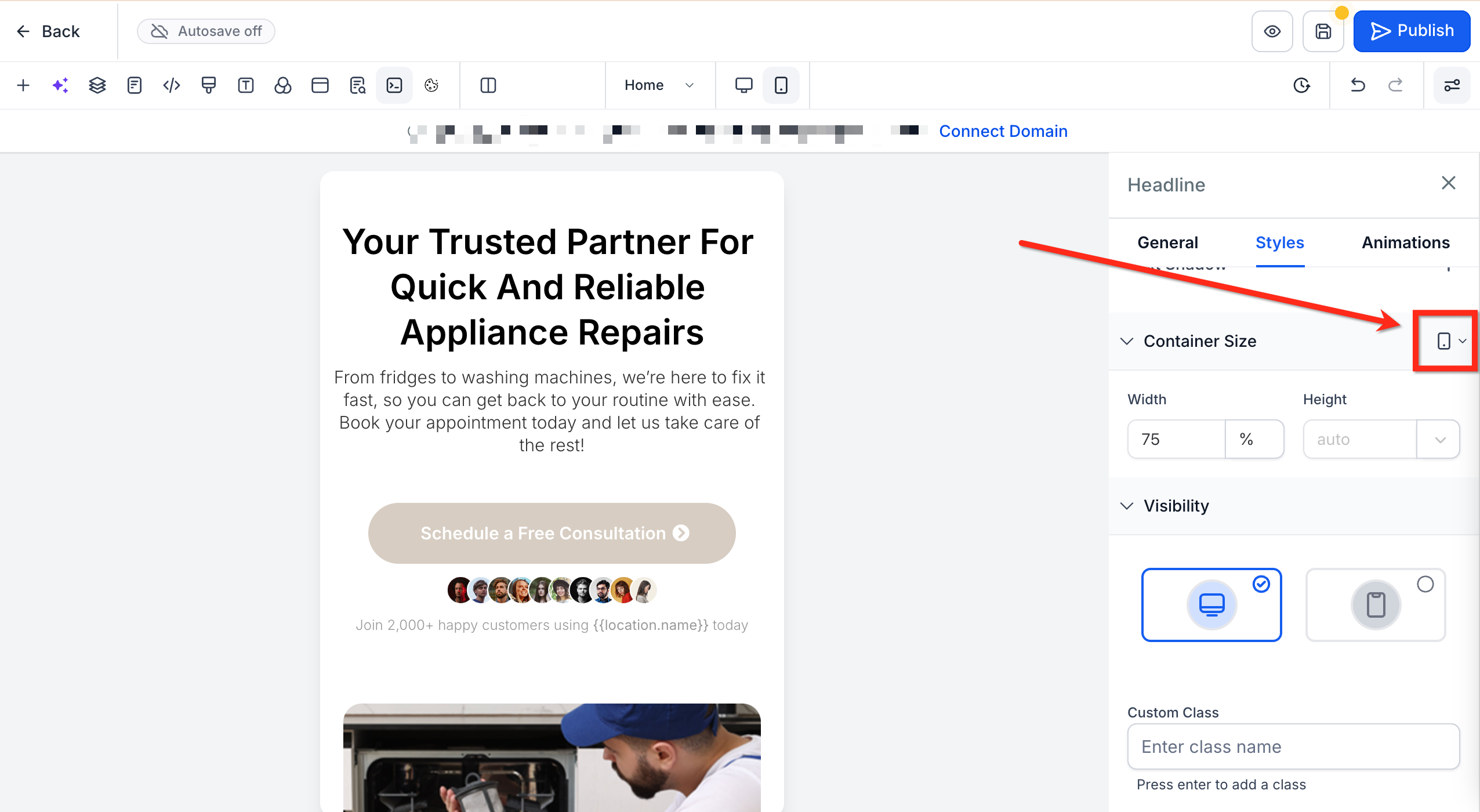
In the Right Sidebar, choose the Styles tab. Scroll to the Container Size section.
Step 4: Set Sizing
Select a sizing unit (px, %, etc.) from the dropdown next to Height and Width. Then enter your desired size for Height and Width.
Step 5: Optimize for Mobile
Use the device toggle next to Container Size to switch to Mobile View. Enter a mobile-specific value if needed.
Frequently Asked Questions
Can I use decimals like 33.33% for equal columns?
Yes! Decimals are supported for fine control (e.g., 33.33% × 3 cards). Just validate on mobile to avoid unintended wrapping.
How do I revert changes?
Set the unit to auto to return the element to its natural size.
Will mobile values affect desktop?
No. Values set in mobile view apply only to mobile devices, leaving your desktop settings intact.
Can I still use the Margin and Padding settings?
Absolutely! Height & Width control adds another layer. Use all three together for complete layout control.
Are negative or zero values allowed for width/height?
No. Negative values or zero are not supported. If you enter a number that is 0 or lower, the element will remain at its current size.