
What is the Mobile Editor?
The Mobile Editor gives you dedicated tools to customize how your forms, surveys, and quizzes look on mobile devices. Instead of compromising between mobile and desktop, you can now style each experience independently — ensuring your enrollment forms always look polished and perform well across every screen size.
Key Benefits of the Mobile Editor
Delivering a smooth, mobile-first experience is key to keeping prospective families engaged. This feature allows you to fine-tune visual elements on mobile without affecting your desktop design.
- Upload custom header and background images just for mobile
- Independently adjust font family, font size, and font weight
- Style specific text elements: Labels, Short Labels, Placeholders
- Preview and test mobile design before publishing
- Ensure forms remain user-friendly and on-brand across devices
- Increase enrollment completion rates by enhancing the mobile experience
How To Use the Mobile Editor
Follow these steps to activate and configure your form, survey, or quiz using the Mobile Editor.
- Open any form, survey, or quiz from your builder dashboard.
- Click the Device Toggle at the top of the screen to switch to Mobile View.
- In Mobile View, the right-hand panel will now offer mobile-specific settings:
- Layout Style: Choose your preferred mobile layout
- Mobile Header Image: Upload an image specifically for mobile headers
- Mobile Background Image: Upload a mobile-specific background image
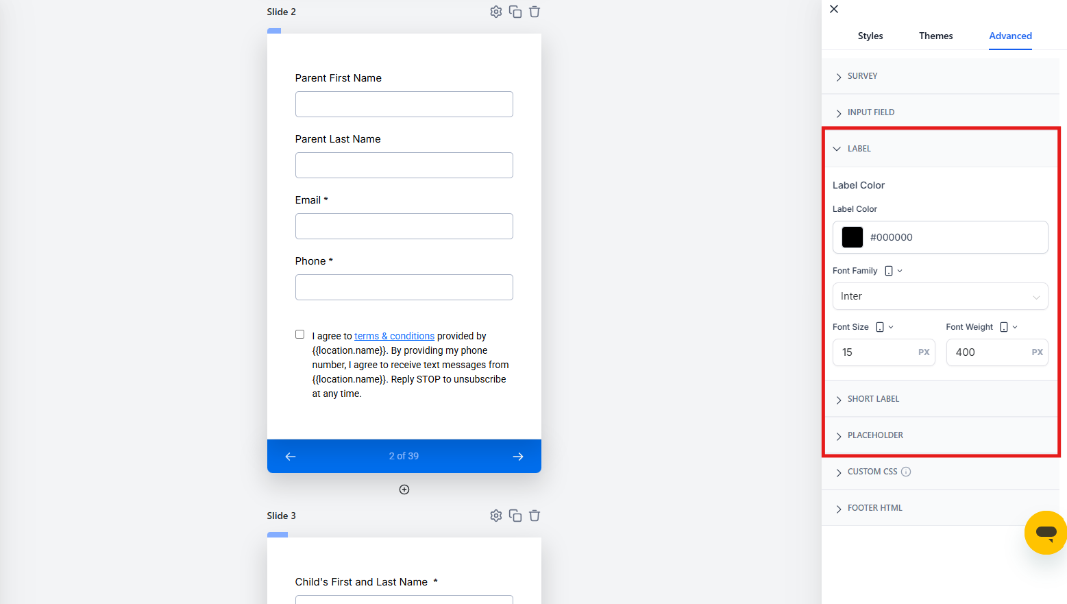
- Font Settings: Adjust Font Family, Font Size, and Font Weight
- These font settings apply individually to:
- Labels (e.g., "Parent Name")
- Short Labels (e.g., field headers in condensed formats)
- Placeholder Text (e.g., "Enter your email")
- Once complete, click Save, then Preview to test your mobile design.
- When satisfied, publish your form — now fully mobile-optimized!
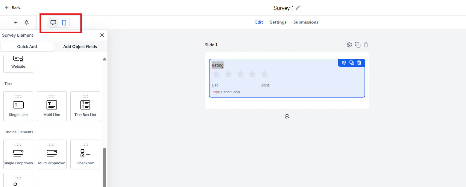
Separate Style Panels for Desktop and Mobile
Independent style controls keep each device crisp without CSS overrides. Match layout to screen size while preserving brand consistency.
Styles set on Mobile do not overwrite Desktop, and vice versa. This means you can create completely different visual experiences for parents viewing your forms on their phones versus their computers.
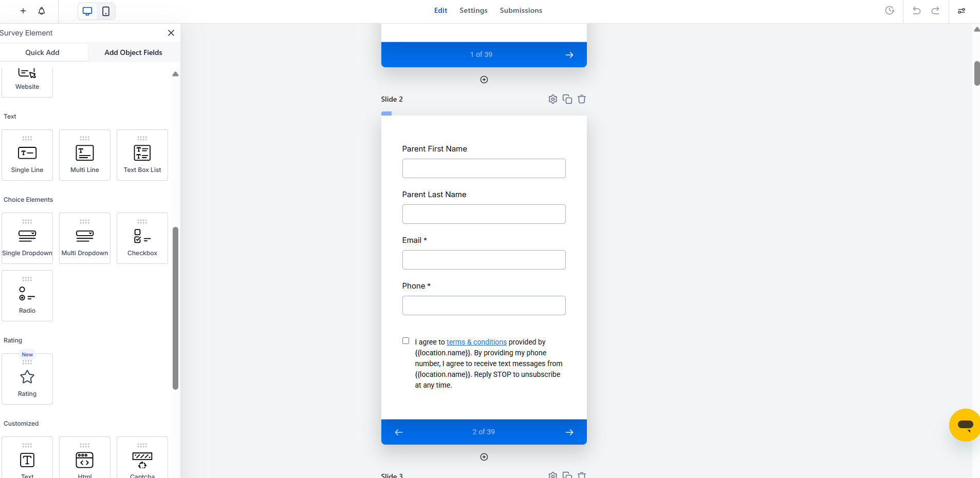
Content vs. Style on Mobile
Content and presentation are configured separately. Edit mobile-specific text for clarity, and fine-tune mobile-only styles for legibility.
Content: You may use different copy on Mobile to make instructions clearer for parents on the go.
Style: Spacing, borders, and typography are device-scoped, so you can adjust padding and font sizes without affecting your desktop layout.
Mobile Header & Background Images
Images scale differently on mobile screens. With this feature, you can upload images specifically optimized for small devices, ensuring your design looks clean and purposeful.
Why this matters:
- Mobile users interact vertically — use tighter, portrait-style images
- Prevent image cropping or distortion that often happens when desktop images scale down
- Showcase your childcare center with photos optimized for phone screens
Mobile Font Styling
Text that reads well on desktop can feel cramped or oversized on a mobile screen. Use the Mobile Editor to adjust font elements individually for a smoother mobile reading experience.
Available Controls:
- Font Family: Choose from available system or custom fonts
- Font Size: Set exact px size for clarity on small screens
- Font Weight: Use bold, light, or normal to enhance visibility
Elements Affected:
- Labels — These guide parents to fill fields properly
- Short Labels — Ideal for condensed layouts or multi-column sections
- Placeholders — Useful for subtle input cues
Frequently Asked Questions
Will changes in Mobile View affect my desktop layout?
No — all edits made in Mobile View apply only to mobile. Your desktop design remains untouched.
Can I use different header and background images for mobile?
Yes! Upload mobile-specific images that better fit smaller screen ratios without affecting your desktop version. This is especially helpful for showcasing your facility's photos in the best light on every device.
Can I preview only the mobile version before publishing?
Absolutely. Use the Preview button while in Mobile View to test what prospective families will see on their phones.
Are font changes global or element-specific?
Font settings can be configured individually for Labels, Short Labels, and Placeholders — giving you complete control over how each text element appears on mobile.
Is the Mobile Editor available on all plans?
Yes, this feature is included in all Enrollio plans that offer Forms, Surveys, or Quizzes.
Next Steps
- Test your enrollment forms with mobile customization to improve completion rates
- Split test mobile-optimized vs. shared designs to see which performs better
- Explore more ways to enhance parent experience with styling options and smart fields
- Review your mobile-specific conversion data using built-in analytics