
How to Use the Color Picker for Enrollment Pages & Sites
The Color Picker lets you define brand colors, default colors, and custom colors—then apply them anywhere on your enrollment pages and sites, right down to individual words or characters.
This article shows you what the Color Picker is, why it matters, and how to use it to keep your childcare center's branding consistent.
What is the Color Picker?
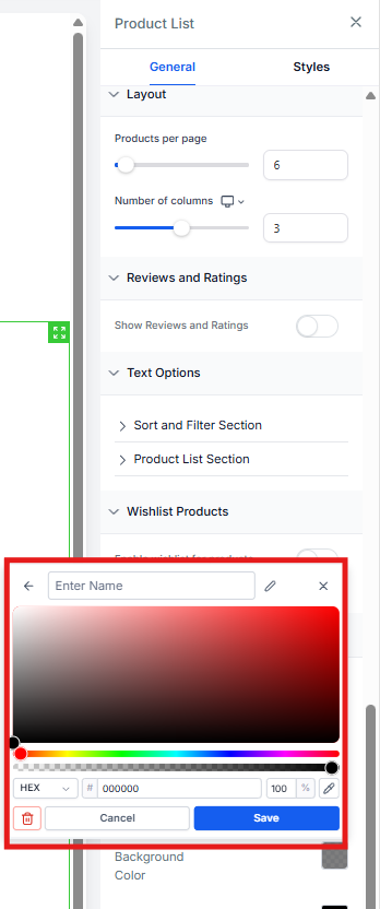
The Color Picker is the design tool inside Enrollio's Page Builder that controls every color you use—from section backgrounds to highlighted text. It displays your brand colors, default colors, and custom colors together in one place.
You can use HEX codes, RGB values, or custom color variables. You can even style individual characters directly from the inline text toolbar.
Key Benefits of the Color Picker
- Unified Palette: View brand, default, and custom colors in a single panel—no tab switching
- Per-Character Control: Color a single word or letter for precise emphasis
- Custom Labels: Name colors (like "Primary Blue" or "Tour CTA Green") for quick reuse
- Format Flexibility: Enter and display colors in HEX, RGB, or custom values
- Duplicate Protection: Validation prevents you from accidentally saving the same shade twice
- Compact Layout: Modern, space-efficient design that loads quickly and stays out of your way
Per-Character and Per-Word Styling
With the inline text editor, you can apply color to individual words or even individual characters. This gives you full control when you want to highlight specific parts of your message—like emphasizing "enroll now" or changing the color of just your center's name.
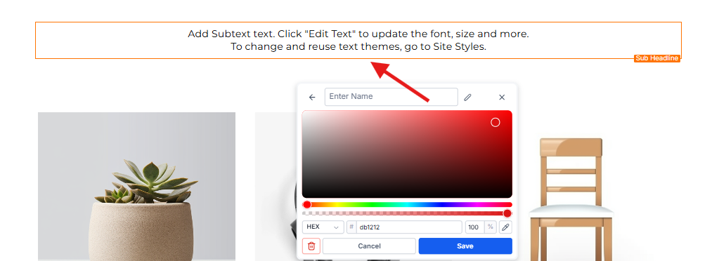
Custom Color Labels & Tooltips
Keep your palette organized by naming your custom colors. This is especially helpful when you have similar shades.
Naming Colors
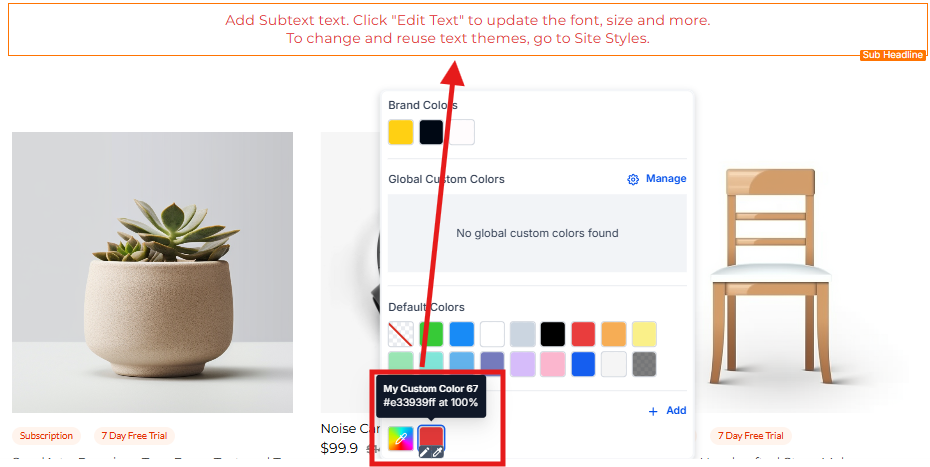
After picking a color, you can give it a descriptive name like "Waitlist Orange" or "Enrollment Button Blue." You can edit or remove these labels at any time.
Custom Label Tooltips
Hover over any custom color to see its label as a tooltip. This makes it easy to pick the right shade without memorizing HEX codes—especially helpful when you're training new staff.
Supported Color Formats
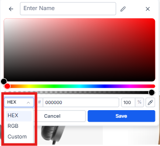
The Color Picker lets you work with colors in the format that suits your workflow. Use the dropdown to switch between formats.
- HEX: A six-character code like #1E90FF. This is the most common format for web design.
- RGB: Three numbers defining red, green, and blue values, like rgb(30,144,255). Useful for precise color control.
- Custom Values: Dynamic tokens like {{ custom_values.primary_color }}. Change the color in one place and it updates everywhere it's used.
Validation and Duplicate Prevention
Custom Color Validation
Custom token values must exist in your account's configuration before they can be stored. This prevents broken color references.
Duplicate Color Prevention
If you try to save a shade that's already in your palette, the picker flags it instantly and prompts you to adjust the value. This keeps your palette clean and consistent.
How to Use the Color Picker
Step 1: Open the Color Picker
- Open an existing enrollment page or site
- Select a section, element, or text block
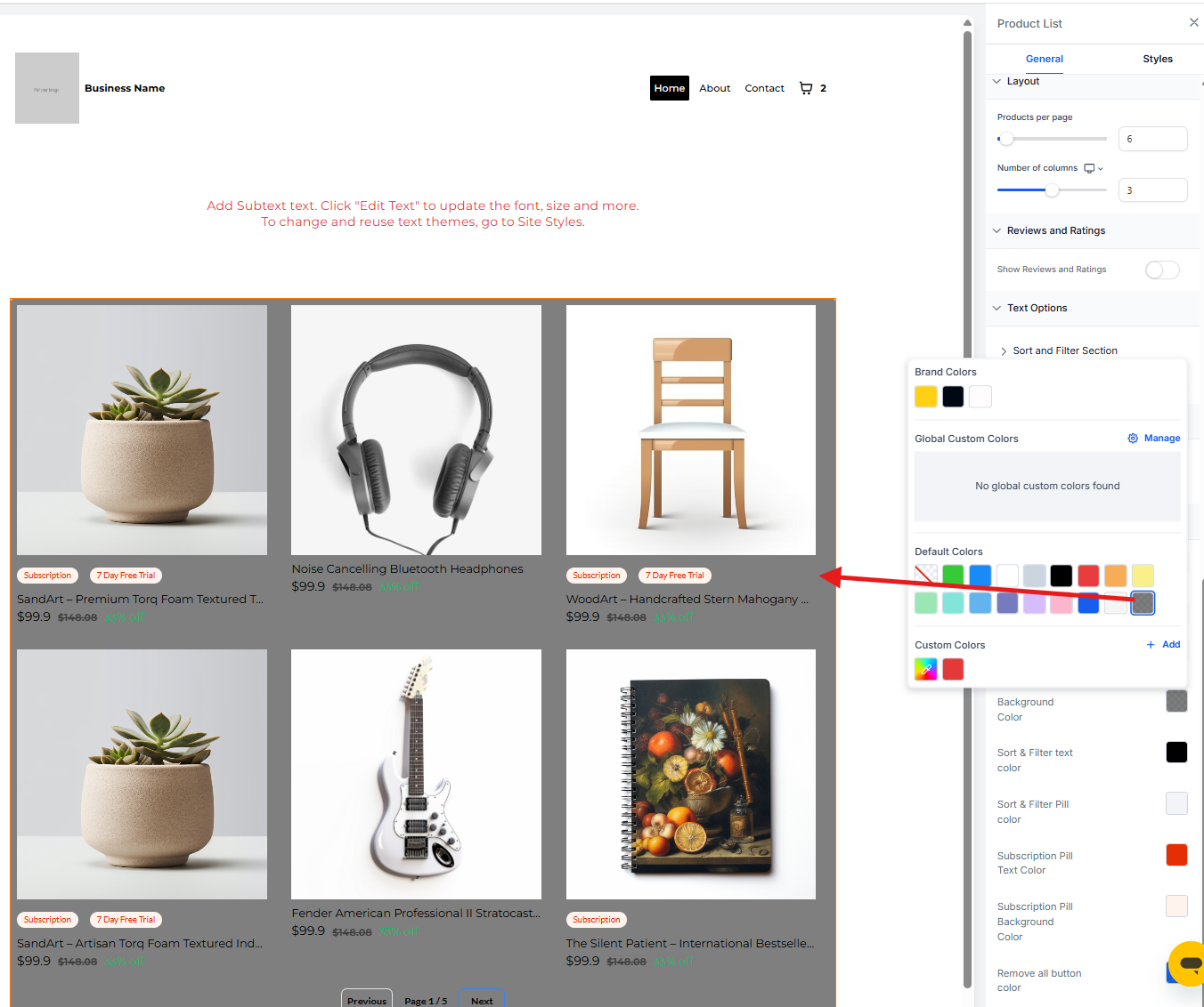
- Click the color square in the style panel, or click the A-icon in the inline toolbar for text
Step 2: Choose a Color
- Pick a shade from the default colors, brand colors, or your saved custom colors
- To create a new custom color, click + Add
Step 3: Create a Custom Color
- Once the custom color panel opens, select your desired color
- Use the dropdown to select between RGB, HEX, or Custom color formats
- Type a descriptive name for the color
- Click Save
Your new color tile will appear in your palette and be ready to use across all your pages.
Button Icon Color
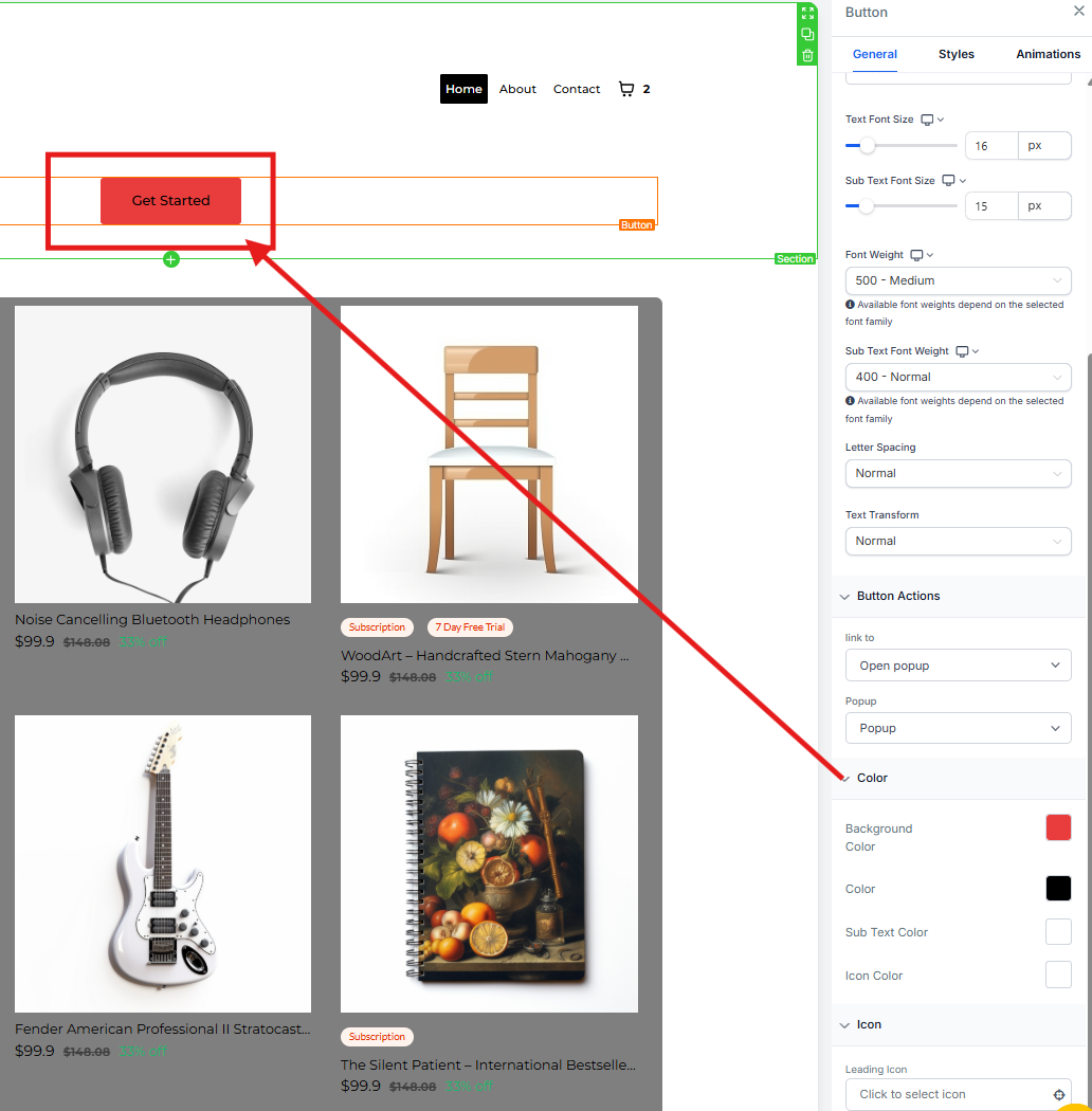
Button icons can now be colored independently, giving you precise control over icon visibility and brand alignment without affecting button text or subtext.
How It Works
- Independent control: Icon color is separate from text and subtext colors
- Color sources: Uses the Color Picker, including Brand Board colors and custom colors
- Design flexibility: Adjust the icon to match brand accents while keeping text highly readable
Frequently Asked Questions
Will existing pages change if I edit a Brand Color?
No. Brand Color updates apply going forward. Colors already saved on existing elements or text stay the same.
Why do I see a "duplicate color" message when I try to save?
The value you entered already exists in your palette, or a saved custom value resolves to the same value. Change the value or edit the existing swatch instead.
Can I rename or delete a custom color without breaking pages?
Yes. Renaming or deleting a swatch doesn't change colors that are already applied on existing pages.
Can I bulk-import brand colors?
Add them in your Brand Board—they automatically appear at the top of the Color Picker palette.
Why won't my custom value color save?
The token must exist in your account's Custom Values, and the final value can't duplicate an existing swatch. Check that the custom value exists in your account settings.
Why do new pages look different from older pages?
Page Builder defaults (fonts, placeholders, and default palette colors) can be updated for newer designs. Your Brand Board or saved templates ensure consistent styling across pages.
Related Articles
- How to Use Brand Boards in Enrollment Pages & Sites
- Sites Overview
- Getting Started - Launch an Enrollment Page
- How to Create a Brand Board