
What Is the New Sidebar?
The new sidebar is a major refresh to the right-hand panel in Enrollio's enrollment page and site builders. Instead of scrolling through one long list of controls, everything is now organized into three clear tabs: General, Styles, and Animations. Related settings are grouped into collapsible panels, so you only see what you need.
The result? Less visual clutter, faster editing, and a sidebar that remembers your preferences as you work.
Why This Makes Your Life Easier
This redesign speeds up how you build and customize enrollment pages, making it easier to create pages that convert prospective families.
- Find controls instantly: Dedicated tabs for content, styling, and animations mean no more hunting through panels
- Cleaner workspace: Collapsible panels keep your view focused on what matters right now
- Remembers your preferences: The sidebar keeps your last-used tab and panel states during your session
- Modern, minimal interface: Cleaner spacing, typography, and icons reduce mental fatigue
- Works for everyone: Whether you're new to Enrollio or a power user, the intuitive layout saves time
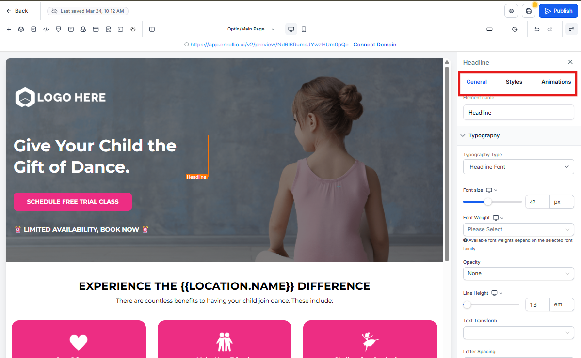
Navigating the Three Tabs
All your element controls now live in three context-aware tabs. Click between them to quickly access different types of settings without wading through unrelated options.
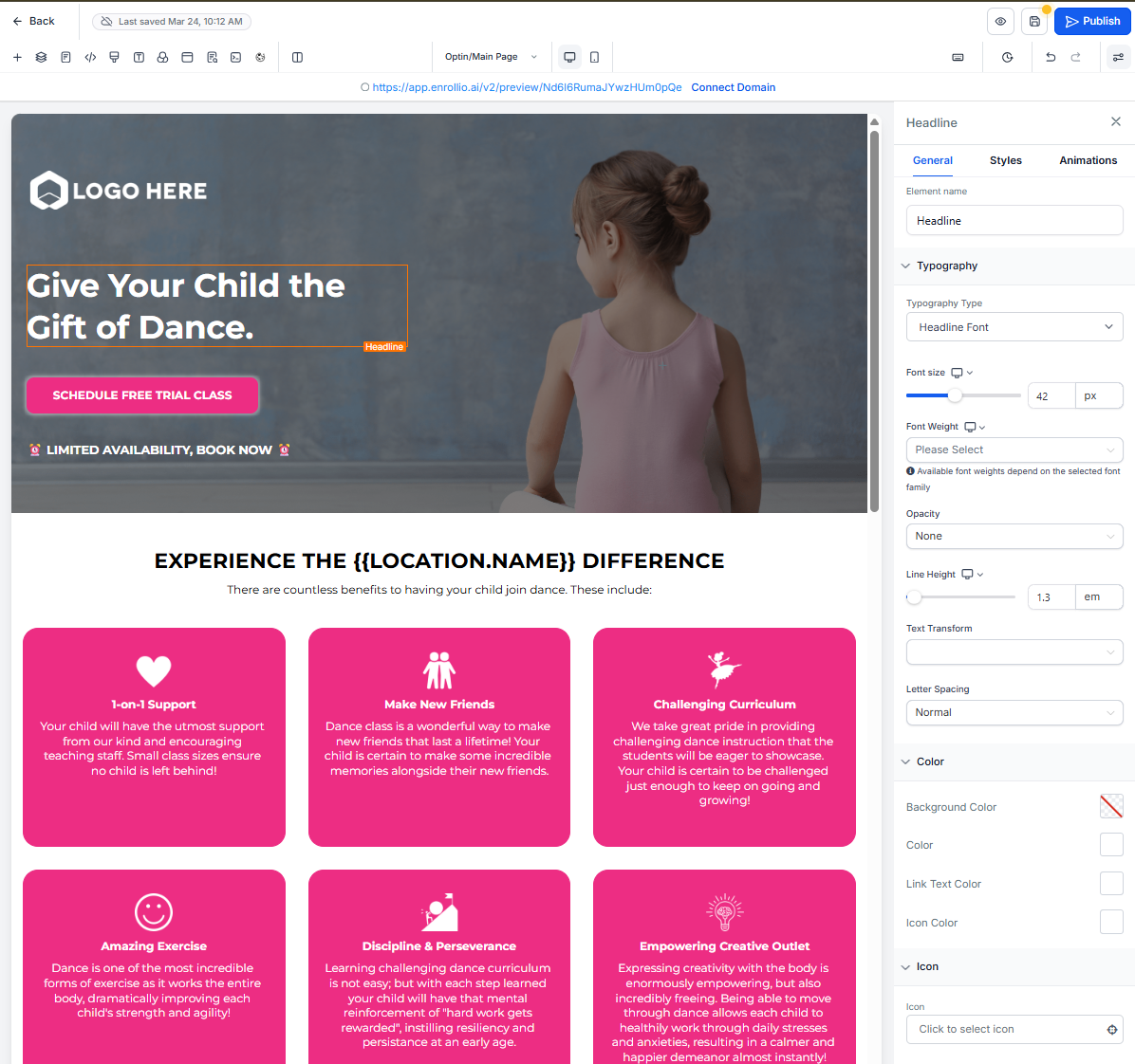
1. General Tab
The General tab is where you adjust an element's core content and behavior. Think of it as the "what does this element say and do" section.
Element Name
At the top, you'll find the Element Name field. Rename layers to keep your page organized—for example, change "Headline" to "Hero Title" so you can find it faster later.
Element Options
These vary by element type and include:
- Text fields for headlines and paragraphs
- URL inputs for buttons and links
- Alt-text for images
- Labels for form fields
Element Actions
Assign interactions like:
- On click, navigate to URL
- Submit form
- Open lightbox
- Trigger a tour booking or enrollment action
Typography Settings
Choose your font family, adjust size and weight, and set opacity. You'll also find controls for line height, letter spacing, text transforms (uppercase/lowercase), and even rotation or skew.
Color Controls
Pick background colors, text colors, link hues, and icon tints using the color picker or custom hex values. Perfect for matching your center's branding.
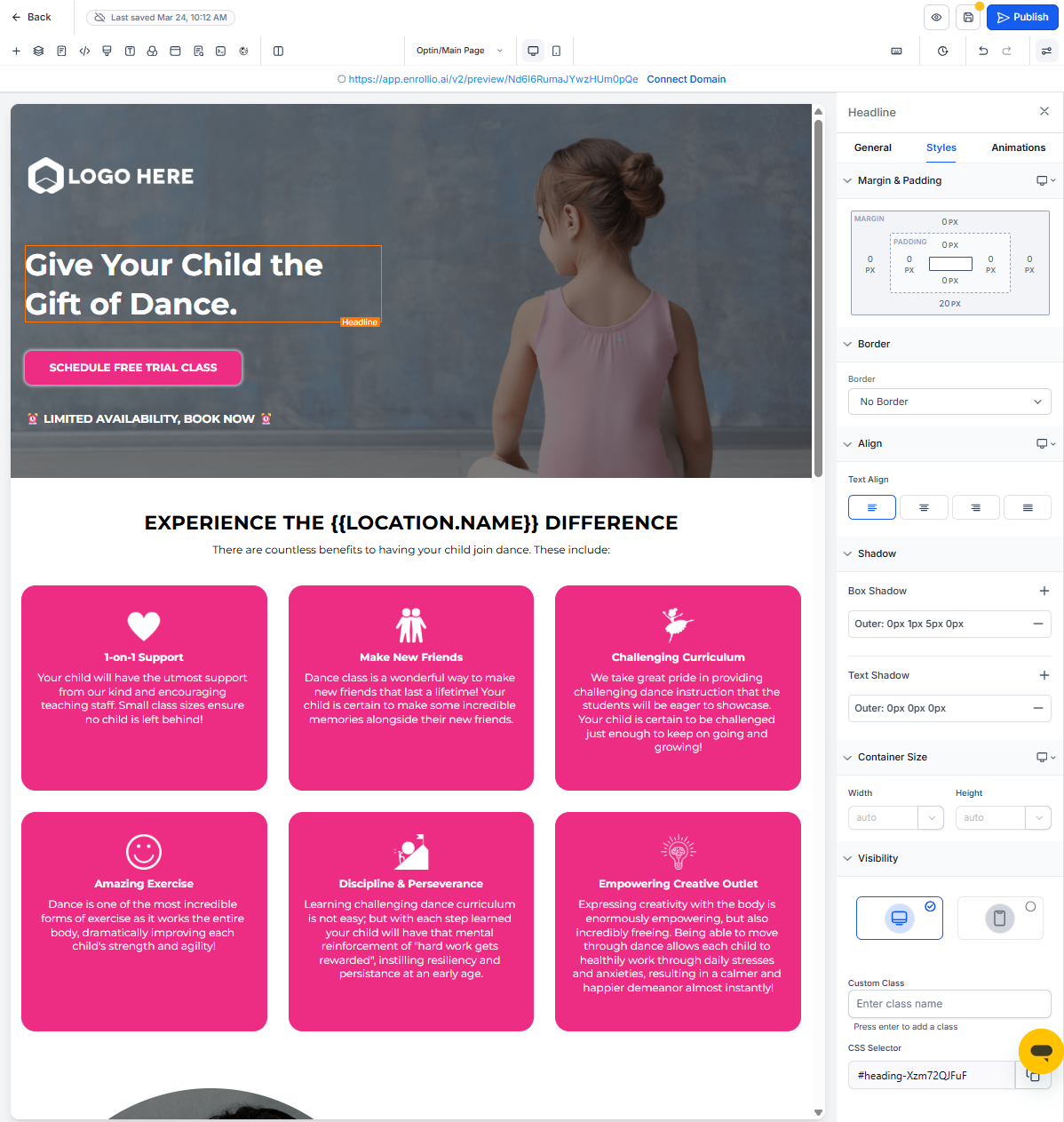
2. Styles Tab
The Styles tab is where you fine-tune layout and visual appearance across all device types. This is your go-to for spacing, borders, and responsive design.
Margin and Padding
Control outer spacing (margin) and inner spacing (padding) to adjust how the element sits relative to its neighbors.
Border
Set border width, style (solid/dashed/dotted), corner radius, and color to frame your elements.
Alignment
Choose text alignment (left/center/right/justify) or object alignment for images and other blocks.
Visibility
Show or hide the element independently on desktop, tablet, or mobile. Great for creating mobile-optimized enrollment pages that look perfect on every device.
Text Shadow
For text elements, add a drop shadow by specifying horizontal/vertical offsets, blur radius, and shadow color.
Custom Class and CSS Selector
Tag the element for any custom styling or advanced customization.
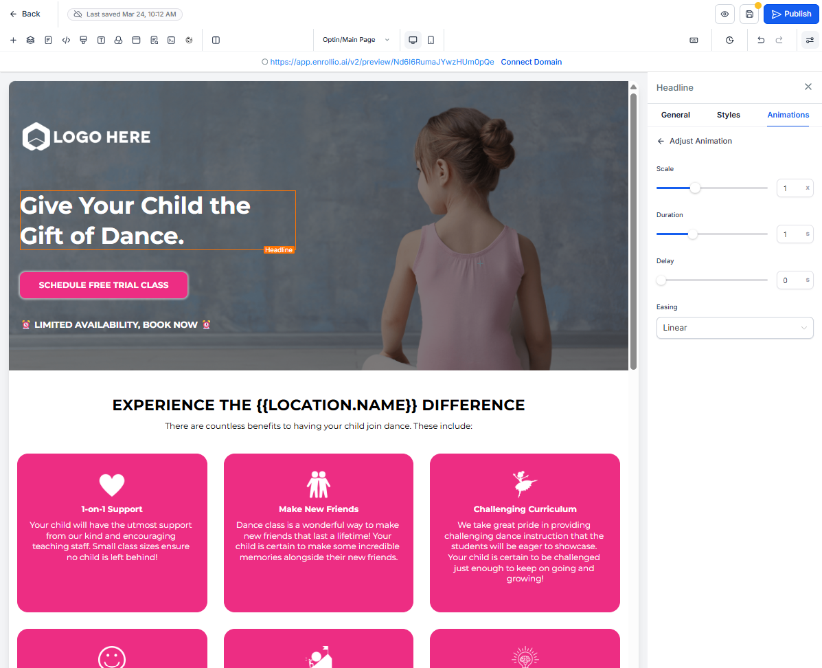
3. Animations Tab
When you're ready to bring elements to life, switch to the Animations tab. Subtle animations can draw attention to key calls-to-action like "Schedule a Tour" or "Enroll Now."
Entrance Animation
Animate elements as they scroll into view with effects like:
- Fade
- Slide (up/down/left/right)
- Bounce
- Zoom
For each effect, control the direction and speed (light, medium, heavy).
Infinite Loop
Apply ongoing motion effects like glow, rocking, or continuous bounce. Use these sparingly to draw attention without overwhelming prospective families.
Clear Button
Reset all animations back to "None" at any time for a fresh start.
Understanding Collapsible Panels
Within each tab, settings are grouped into collapsible panels. Click a panel header to expand or collapse it.
Why this matters:
- Panels stay open or closed throughout your editing session
- Advanced or rarely-used settings can stay collapsed for a cleaner view
- Focus only on the controls you need right now
This makes your workspace more organized, especially when building complex enrollment pages with multiple sections.
Smart Memory for Tabs and Panels
The sidebar remembers your preferences throughout your session, so you don't waste time reopening the same tabs and panels.
Tab memory: The last active tab stays selected when you switch between elements. If you're working in the Styles tab and click a different element, the Styles tab stays open.
Panel memory: Collapsed or expanded states persist as you move through elements. If you collapse the Border panel, it stays collapsed.
New element behavior: When you add a new element, all panels open by default to give you quick access to every setting.
These enhancements eliminate repetitive clicking, saving you time during design sessions.
Visual Improvements
Beyond the new organization, the sidebar now has a cleaner, more modern look:
- Improved spacing and layout reduce visual noise
- Uniform styling between controls
- Cleaner typography and simplified icons
- Consistent design patterns across the builder
All of these changes reduce mental fatigue and help you stay focused while designing enrollment pages and sites.
Frequently Asked Questions
Q: Will this update affect my existing enrollment pages or site styling?
No. Your live pages remain unchanged. This update only improves the editing interface.
Q: Will my previous settings be affected?
No. Only the sidebar's layout changes—your element settings stay exactly as they were.
Q: Does the new sidebar impact performance?
Yes, positively. The layout is optimized for smoother navigation and faster adjustments.
Q: Are there new design controls in this update?
Not in this release. This update focuses on improving the interface and user experience. New controls are planned for future updates.
Next Steps
- Open any enrollment page or site in the builder and start editing elements using the new tab structure
- Collapse panels you use less frequently to create a cleaner workspace
- Take advantage of persistent states to speed up your design sessions
- Experiment with entrance animations on key calls-to-action to see what converts best