
What You Can Do
You have full control over font weight (how bold or light your text appears) for any element on your enrollment pages and sites. This helps you create hierarchy, emphasize calls-to-action, and match your brand's visual identity.
Font weight options are available for:
- Text blocks
- Buttons
- Navigation menus
- FAQ sections
- Countdown timers
- Category navigation
- Image feature components
You can even set different font weights for mobile and desktop views, giving you complete design flexibility.
How to Change Font Weight
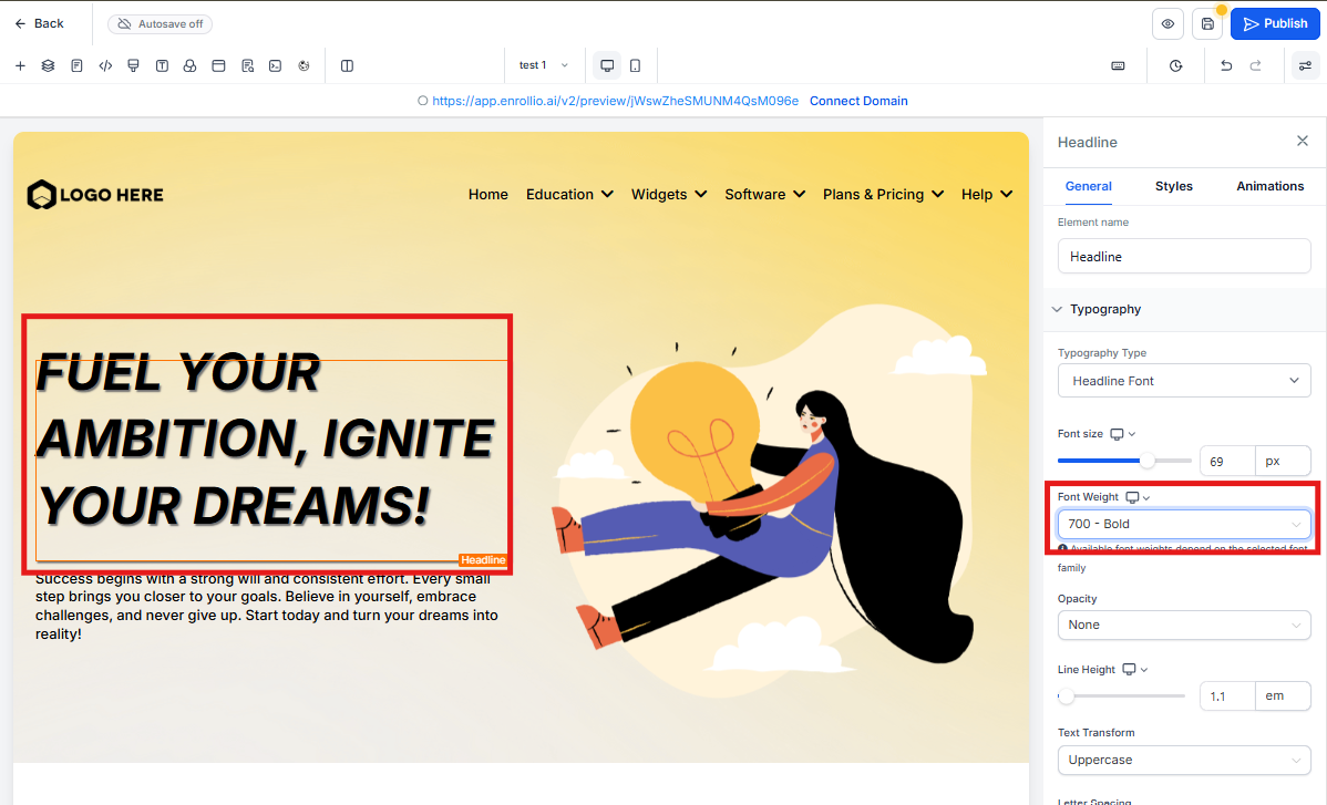
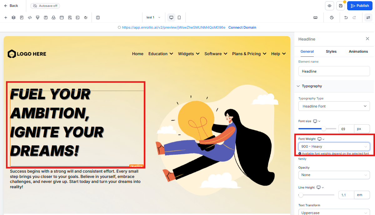
- Open your enrollment page or site in the page builder
- Click on any text element, button, or component
- Look for the font weight dropdown below the font size settings
- Select your desired weight (from thin to extra bold)
- To customize for different devices, toggle between desktop and mobile views and adjust separately
- Click Save or Publish to apply your changes
Important Notes
Font family compatibility: Not all font families support every weight option. If you select a weight that your chosen font doesn't support, you won't see any change. Try switching to a different font family if your desired weight isn't working.
Text editor formatting takes priority: If you've already made text bold using the text editor's bold button, the font weight setting won't override it. Remove the bold formatting in the editor first if you want to use the font weight dropdown instead.
Better Font Size Control
We've also improved the font size slider sensitivity for smoother adjustments. You can now fine-tune your text sizes with 100 increments instead of jumping in larger steps.