
Overview
Pipeline widgets help you visualize how prospective families move through your enrollment process. Two key widgets show this journey: the Funnel widget tracks progression through stages, while the Stage Distribution widget shows where families are currently located in your pipeline.
Funnel Widget
The Funnel widget shows how enrollment opportunities flow from one stage to the next. It's designed to help you see where families enter your pipeline and track their journey toward enrollment.
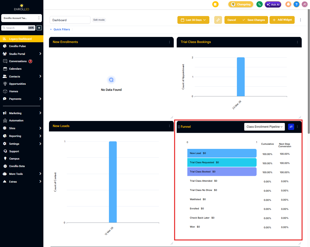
You can switch between different enrollment pipelines using the dropdown menu at the top of the widget.
Understanding Your Funnel Data
The funnel widget displays sequential data showing how opportunities move from stage to stage. Each section represents a stage in your enrollment process, plus a final "WON" section for completed enrollments.
Here's how the data flows:
Let's say your enrollment pipeline has these stages:
- Stage 1: Tour Scheduled → 229 families
- Stage 2: Tour Completed → 4 families
- Stage 3: Application Started → 32 families
- Stage 4: Application Submitted → 7 families
- Stage 5: Documents Received → 0 families
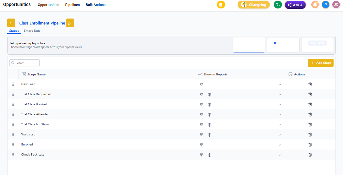
The funnel widget will display 6 sections total: one for each stage plus the WON section at the end.
First Section (Tour Scheduled): Shows the total number of enrollment opportunities that entered your pipeline — 272 in this example. This includes opportunities at any stage and with any status (open, lost, won, or abandoned).
Second Section (Tour Completed): Shows 43 opportunities, which includes everyone from this stage forward, plus all won enrollments. We remove families still in the previous stage.
The formula: Opportunities in each section = opportunities from current stage to last stage + all won enrollments
Third Section (Application Started): Shows 43 opportunities (32 in Application Started + 7 in Application Submitted + 0 in Documents Received + 4 won enrollments).
Final Section (WON): Displays only the families who completed enrollment.
Conversion Rates Explained
The cumulative conversion rate shows the percentage of families who progressed through all stages. The next step conversion rate is specific to movement from one stage to the next.
Revenue in each section follows the same sequential calculation, showing total revenue from that stage forward.
Stage Distribution Widget
The Stage Distribution widget shows where your active enrollment opportunities are right now. It displays the number of OPEN opportunities in each individual stage, with won and lost opportunities shown separately.
This widget helps you quickly identify bottlenecks in your enrollment process. If you see many families stuck in one stage, you'll know where to focus your follow-up efforts.
Conversion rates show the percentage of families who successfully moved to each specific stage.
Like the Funnel widget, you can switch between different enrollment pipelines using the dropdown menu.
Using These Widgets Together
The Funnel widget shows flow and progression over time, while the Stage Distribution widget shows your current snapshot. Use them together to understand both where families are moving and where they're getting stuck in your enrollment process.