
Your enrollment pages need to look great whether parents are browsing on their phone during pickup or on their laptop at home. Enrollio's page builder lets you preview and optimize for both desktop and mobile views.
Switching Between Desktop and Mobile Preview
When editing any enrollment page or landing page:
- Open the page in the page builder
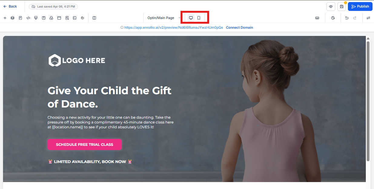
- Look for the device icons in the top toolbar
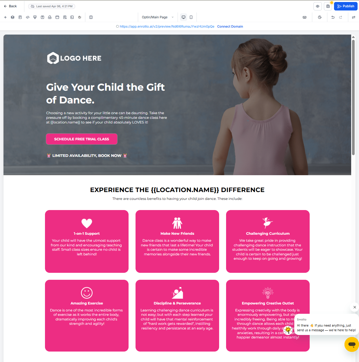
- Click the desktop icon to see how your page appears on computers
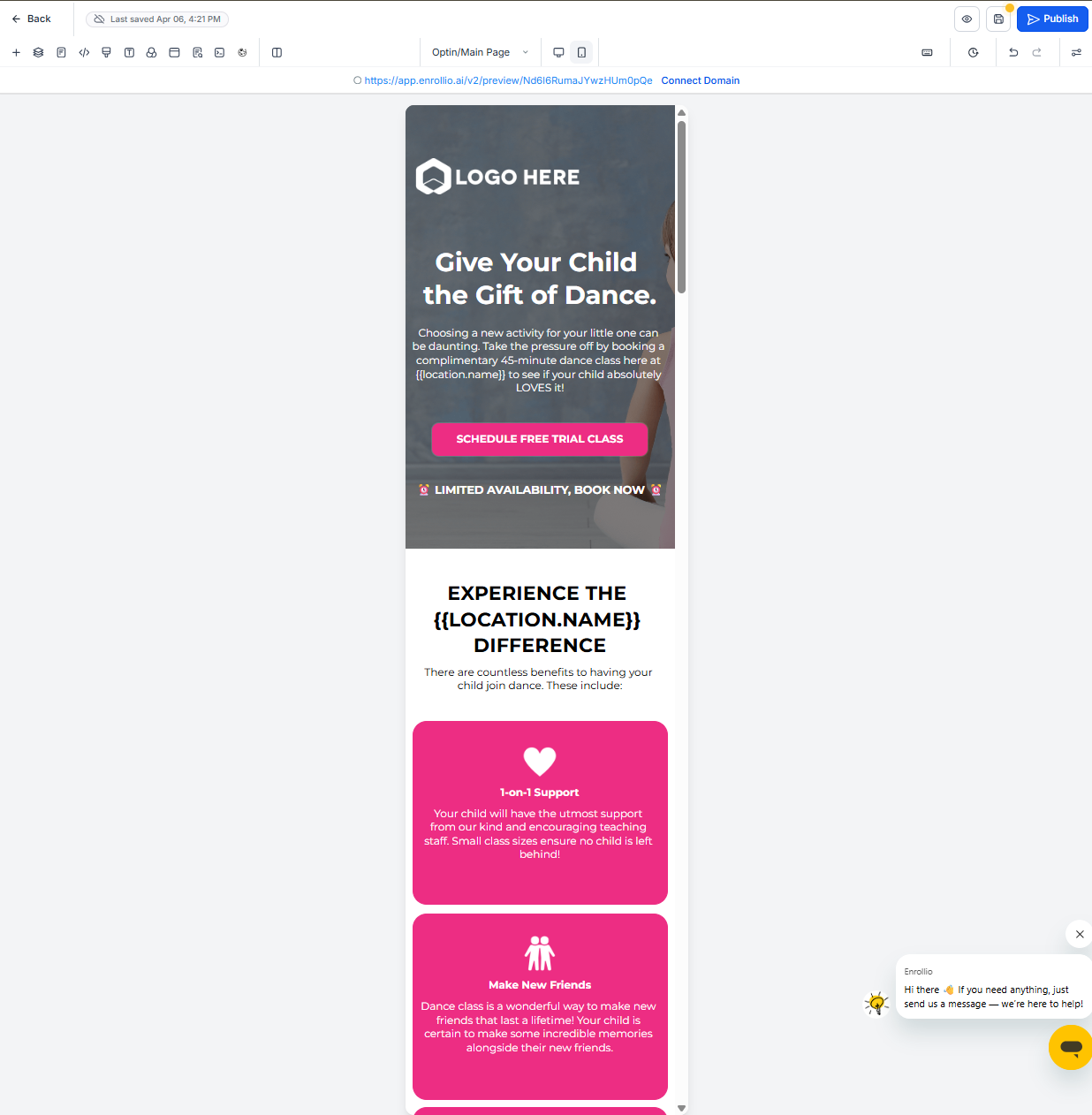
- Click the mobile icon to see how it looks on phones
Why Both Views Matter
Most parents will visit your enrollment pages on their phones first. If your form is hard to read or buttons are too small on mobile, you'll lose enrollments.
Always check both views before publishing any page. What looks perfect on desktop might be cramped or misaligned on mobile.
Mobile-Specific Adjustments
You can customize elements differently for mobile and desktop:
- Text size: Make headings and body text larger on mobile so parents don't have to zoom
- Button spacing: Add more padding around buttons on mobile for easier tapping
- Image placement: Stack images vertically on mobile instead of side-by-side
- Form fields: Ensure form fields are full-width on mobile for easier completion
Common Mobile Issues to Avoid
- Text that's too small to read without zooming
- Buttons placed too close together (parents will tap the wrong one)
- Forms that require horizontal scrolling
- Images that don't resize and push content off-screen
Remember: if your enrollment page doesn't work well on mobile, you're making it harder for busy parents to sign up. Always optimize for both views.