
Overview
The Site and Page Analytics dashboard helps you understand how your enrollment pages, websites, forms, and surveys perform. Track key metrics, spot trends, and make data-driven decisions to attract more families—all from one central place.
Instead of jumping between different pages and tools, you can view all your performance data in a single dashboard. Choose what you want to analyze (enrollment pages, forms, surveys, etc.), set your date range, and see clear charts and metrics instantly.
Why Use Site Analytics
Save Time: All your web performance data lives in one place. No more manual spreadsheets or bouncing between screens.
Make Better Decisions: See which enrollment pages convert best, which forms get the most submissions, and where families drop off in your process.
Spot Trends Fast: Visual charts and comparison data help you identify patterns and opportunities at a glance.
Key Metrics You'll Track
- Page Views: How many times families visited your enrollment pages or website, including unique views
- Opt-ins: Number of conversions—form submissions, tour bookings, or survey completions
- Sales: Revenue generated through your enrollment pages
- Opt-in Conversion Rate: Percentage of visitors who took action (opt-ins divided by unique page views)
How to Access Analytics
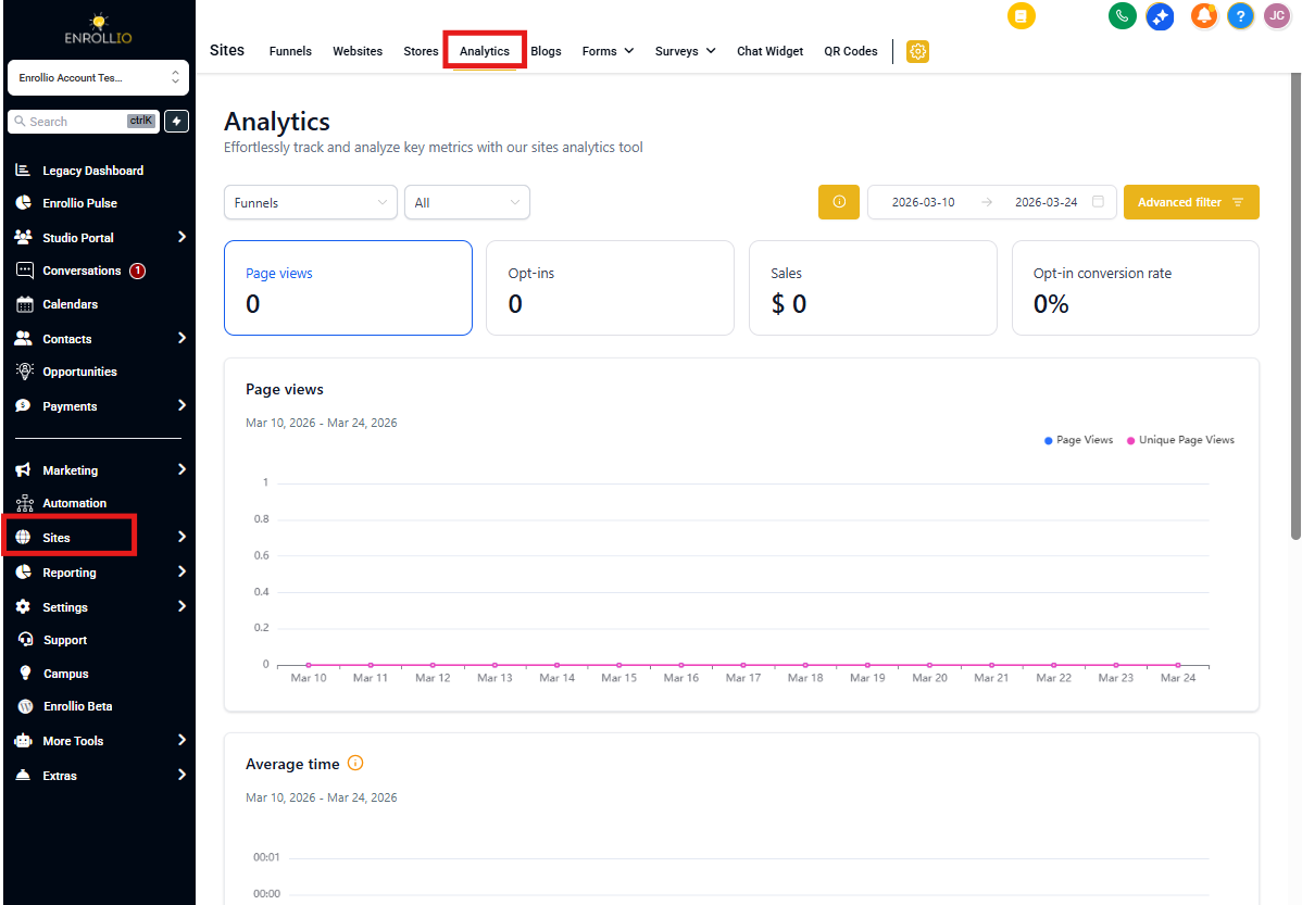
- From your Enrollio dashboard, click Sites in the left navigation
- Click the Analytics tab at the top
Choose What to Analyze
Start by selecting which type of asset you want to review. You can analyze one type at a time:
- Enrollment Pages: Your landing pages and enrollment flows
- Enrollment Sites: Your full childcare center website
- Blogs: Blog posts and content
- Webinars: Online events and info sessions
- Forms: Contact forms, interest forms, and applications
- Surveys: Parent surveys and feedback forms
- QR Codes: Codes you've created for offline-to-online tracking
- External Tracking: Pages you're tracking outside of Enrollio
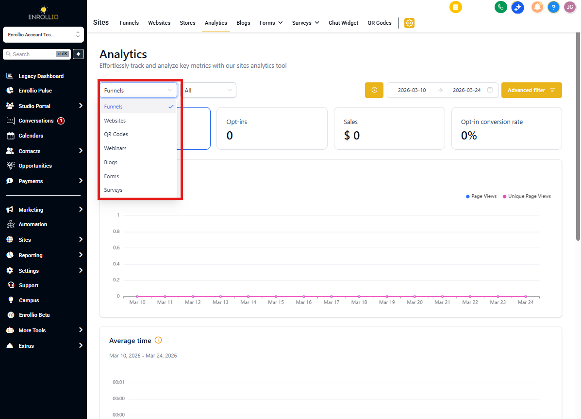
Note: The metrics and charts you see will change based on which asset type you select. Each type shows the data that matters most for that specific category.
Filter Your Data
Once you've chosen an asset type, narrow your focus with two filters:
Select a Specific Asset (Optional)
Want to see how one particular enrollment page or form performs? Use this dropdown to choose it. Leave it set to "All" to see combined results for everything in that category.
Pro Tip: When you switch asset types, this filter resets to "All" automatically.
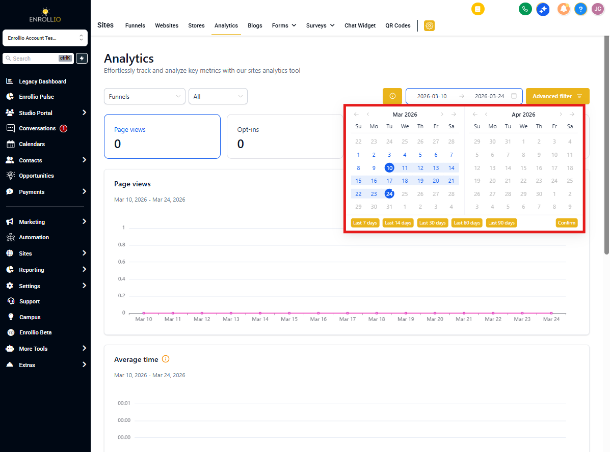
Set Your Date Range
Click the date picker in the upper-right corner to choose your timeframe. The default is the last 14 days.
The dashboard automatically compares your selected period to the same number of days immediately before. For example, if you choose the last 14 days, you'll see how that compares to the previous 14 days.
Understanding the KPI Cards
The metric cards at the top of your dashboard work like interactive tabs. Click any card to update all the charts below and dive deeper into that specific metric.
Each card shows:
- The current metric value for your selected period
- A percentage change compared to the previous period
- A quick up or down indicator
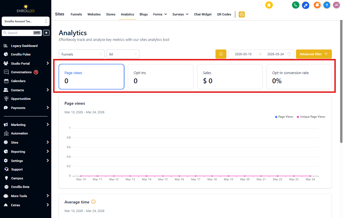
Note: Some asset types have fewer metrics. For example, QR Codes show a simplified view with just total scans and scans by code—no KPI card toggles appear for that type.
Step-by-Step: Analyzing Your Enrollment Pages
Here's a quick walkthrough for checking your enrollment page performance:
- Navigate to Sites → Analytics
- Select Enrollment Pages from the asset type dropdown
- Choose a specific page (optional) or leave as "All"
- Set your date range to match your goals (last 30 days, last quarter, etc.)
- Click each KPI card to explore different metrics—start with conversion rate to see what's working
- Scroll through the charts to spot trends, peak days, and drop-off points
Repeat this process for forms, surveys, or any other asset type you want to review.
Making Sense of the Comparison Data
Every metric shows a percentage change from the previous period. This helps you quickly answer questions like:
- Are more families visiting your enrollment pages this month?
- Is your new welcome form getting better engagement?
- Did that recent marketing push increase tour bookings?
A green arrow and positive percentage mean growth. A red arrow means the metric decreased compared to the previous period.
Frequently Asked Questions
Why don't I see KPI cards when viewing QR Codes?
QR Codes use a simplified dashboard showing just total scans and individual code breakdowns. The interactive KPI cards aren't available for this asset type.
How exactly is the comparison percentage calculated?
Enrollio compares your selected date range to the immediately previous period of equal length. If you choose the last 14 days, it compares to the 14 days before that. For a custom range of March 1-15, it compares to February 14-28.
I'm not seeing data for External Tracking. What's wrong?
For External Tracking to work, you need the Enrollio tracking script installed on your external website. If the script is missing, blocked by privacy tools, or incorrectly implemented, views and submissions won't appear in your dashboard. Double-check that the script is present and loading correctly.
Can I export this data or share it with my team?
Currently, the analytics dashboard is view-only within Enrollio. You can take screenshots or manually compile data for reports. We're working on export and sharing features for future updates.
What counts as an "opt-in"?
An opt-in is any conversion action on your page—submitting a contact form, booking a tour, completing a survey, or registering for a webinar. The specific actions depend on what's set up on your enrollment page or form.
Pro Tips for Better Analytics
- Check weekly: Review your analytics every Monday to spot trends early and adjust your approach
- Compare apples to apples: Use consistent date ranges when making decisions (compare September to September, not September to December)
- Focus on conversion rate: Page views are great, but conversion rate tells you if your pages actually work
- Test one change at a time: If you update a form or page, give it at least 7-14 days before checking results