
Widgets are powerful tools for visualizing your enrollment data, and customizing them ensures they deliver the insights you need to run your childcare business effectively. This guide explains how to modify widget settings, add filters, experiment with chart types, and fine-tune the display to match your goals.
Transform your dashboard into an effective and visually compelling data center with these simple steps.
What Are Dashboard Widgets?
Dashboard widgets are small, interactive tools that present key data points in visual formats like charts, graphs, and tables. These widgets help you see enrollment trends, tour bookings, parent engagement, and other critical metrics at a glance.
Customizing them allows you to tailor their appearance and functionality, ensuring they align perfectly with what matters most to your center.
Why Should You Customize Dashboard Widgets?
Customizing widgets offers several benefits:
- Personalized Insights: Highlight the metrics most relevant to your enrollment goals — like tours booked, waitlist length, or enrollment conversion rates.
- Enhanced Clarity: Adjust titles, filters, and layouts to make data interpretation straightforward.
- Improved Comparisons: Add filters and conditions to compare different time periods, programs, or age groups easily.
- Efficiency: Quickly access the data you need without navigating through irrelevant information.
Where to Find the Widget Customization Options
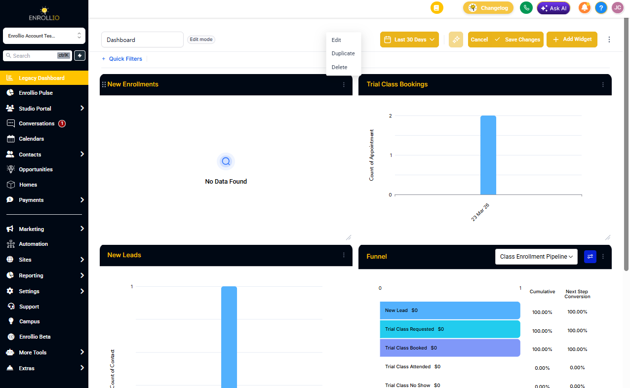
- Navigate to your dashboard within the platform.
- Choose the widget you want to modify from the list.
- Click on the widget to access the configuration and customization options.
How to Customize Dashboard Widgets
Step 1: Choose the Widget
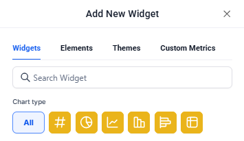
Select the widget you want to modify from the widget list. By default, each widget comes with a pre-selected chart type under the "ALL" filter.
To change the chart type, click on the chart icon and choose the one that best fits your data.
Step 2: Configure the Widget Settings
Click the "Configure" tab to adjust the widget:
- Title: Rename the widget to make its purpose clear (e.g., "Tours This Month" or "Enrollment by Program").
- Metrics: Update the data points displayed in the widget. Multiple metrics can be added for Line, Bar, and Horizontal bar charts.
- Group: Define grouping options for charts like Donut charts.
- View By: Select the secondary dimension for visualizations like line or bar charts.
- Breakdown: Adjust the time period frequency (daily, weekly, monthly).
- Date Property: Choose the date type (e.g., Created Date, Updated Date) for fetching results.
- Date Range Override: Override the dashboard's global date range for this widget.
- Order: Sort the results in ascending or descending order.
- Limit: Set a maximum number of results displayed.
- Comparison Date Property: Add a comparison percentage for better context.
Advanced settings are available for further personalization, but they're optional.
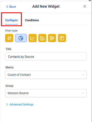
Chart Type Picker in Widget Settings
Choosing the right visualization improves readability and decision-making. Select your chart type directly in the widget settings without leaving the flow.
How to Pick a Chart:
- Open Settings → Configure.
- Choose the desired Chart Type (e.g., bar, line, pie) and review the live preview.
- Continue to Conditions or Save your widget.
Step 3: Add Conditions
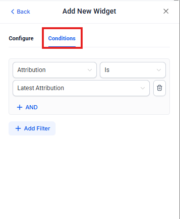
Conditions let you filter your widget data to show exactly what you need. For example, you might want to see only tours for toddler programs, or enrollments from a specific date range.
Nested Filter Groups (OR Logic)
Grouping filters enables advanced logic to match real-world segments. Use multiple groups to evaluate OR conditions, while AND within each group narrows results precisely.
How to Build Groups:
- Open the widget → Conditions.
- Click Add Filter to create Group 1.
- Use +AND to add more filters inside the same group.
- Click +Add Filter again to start Group 2 (adds an OR condition).
- Repeat as needed, then Save.
Note: Visitor Data Widgets support only one filter group.
Duplicate Filters via Groups
Sometimes you need the same field twice (e.g., Source = Google OR Source = Facebook). Duplicates are now supported through separate groups, enabling broader matching without workarounds.
Example:
- Group 1: Source = Google
- Group 2: Source = Facebook
Linked Filter Warnings
Certain filters depend on each other (e.g., Enrollment Pipeline and Stage). When combinations conflict, you'll see clear warnings to help adjust conditions for accurate data.
Behavior: Warnings appear inline within Conditions to highlight linked fields. Adjust either filter to resolve the message, then Save.
Note: If no data matches a filter, the widget cannot be saved unless the filter is adjusted or removed.
Step 4: Save Changes
Once all changes are made:
- Click Save to update the widget.
- Adjust the widget's size or position on the dashboard if needed.
- Save your dashboard layout to finalize the changes.